Note: I designed this product as part of my work at Funsize.
Designing Credit Karma Marketplace (2018)
Building trust, clarity, and confidence into financial decision-making
Case study from my work on Credit Karma Marketplace in 2018
Overview
In 2018, I worked on Credit Karma Marketplace, a core product experience designed to help members confidently shop for credit cards, personal loans, and other financial products — all personalized to their credit profile.
The challenge wasn’t simply helping users find offers. It was helping them understand why an offer was right for them, how likely they were to be approved, and how each decision fit into their broader financial picture.
Marketplace became the bridge between credit insight and real financial action.
The Problem: Financial Choice Without Context
At the time, most financial comparison sites focused on volume: lists of offers, promotional rates, and generic rankings. What they lacked was context.
From research and internal analysis, we identified consistent pain points:
- Users didn’t know if they would be approved before applying
- Offers felt generic and disconnected from personal goals
- Credit decisions created anxiety due to hidden consequences
- Comparison tools optimized for lenders, not people
Our goal was to answer a simple question:
“Why is this offer being shown to me — and what happens if I take it?”
Competitive Analysis
We conducted a competitive analysis across platforms such as LendingTree, NerdWallet, CreditCards.com, and Bankrate.
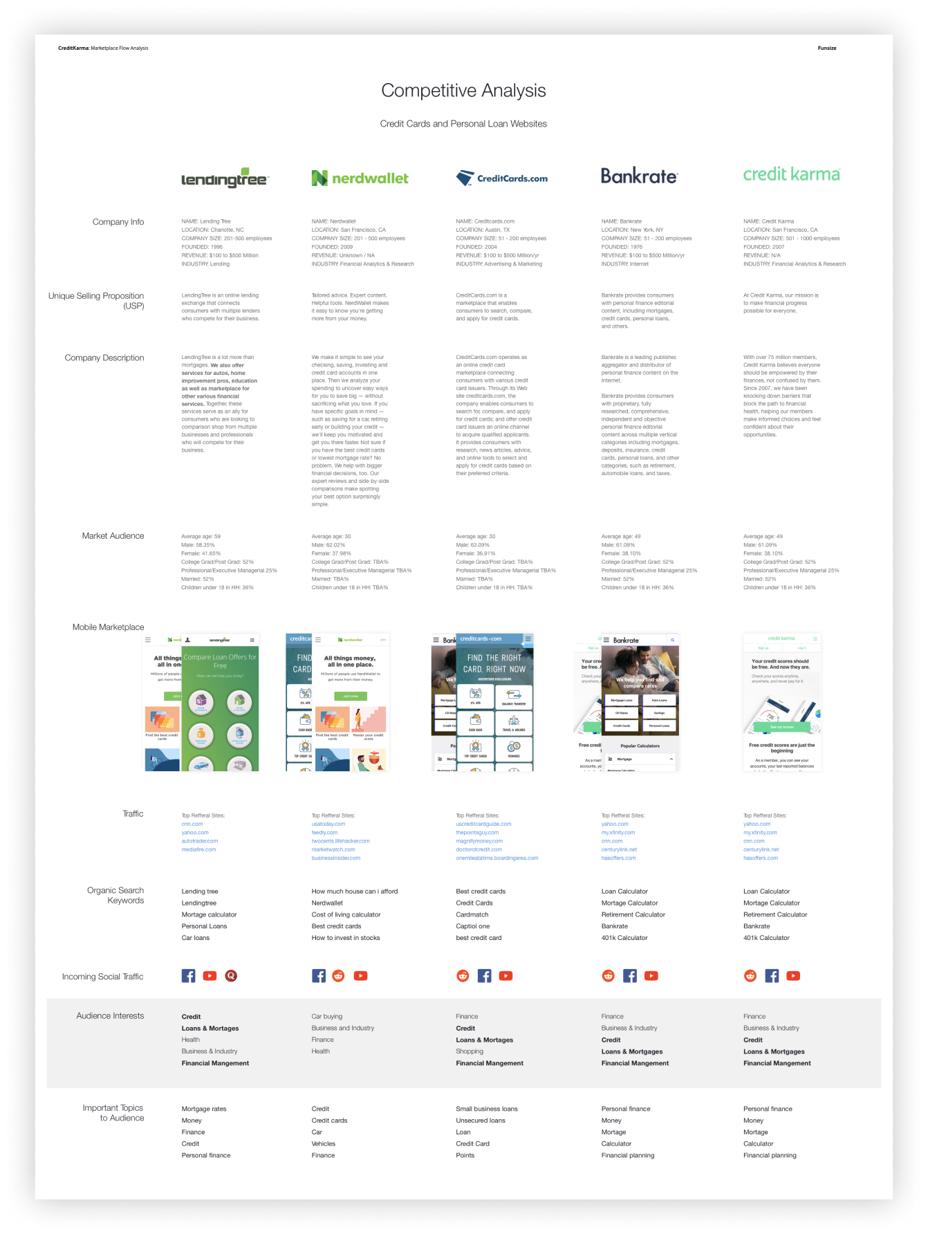
Key insights:
- Most competitors optimized heavily for SEO and affiliate conversion
- Personalization was shallow or nonexistent
- Approval likelihood was rarely communicated clearly
- Financial education was separated from product discovery
Credit Karma’s advantage was unique access to real credit data and member behavior, allowing us to move beyond generic rankings and into personalized, data-backed recommendations.
Design Principle: Explain the “Why”
Everything in Marketplace was built around a single principle:
Transparency builds trust.
Rather than hiding logic behind algorithms, we surfaced it directly in the UI:
- Approval odds
- Credit impact context
- Behavioral guidance
- Community signals
Offers shifted from promotional content to advice-backed recommendations.
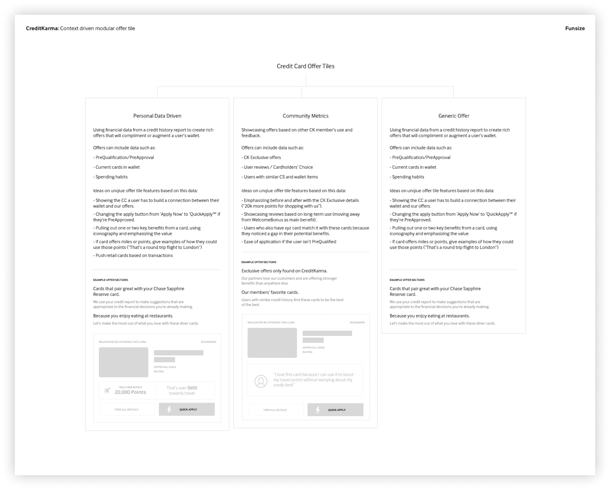
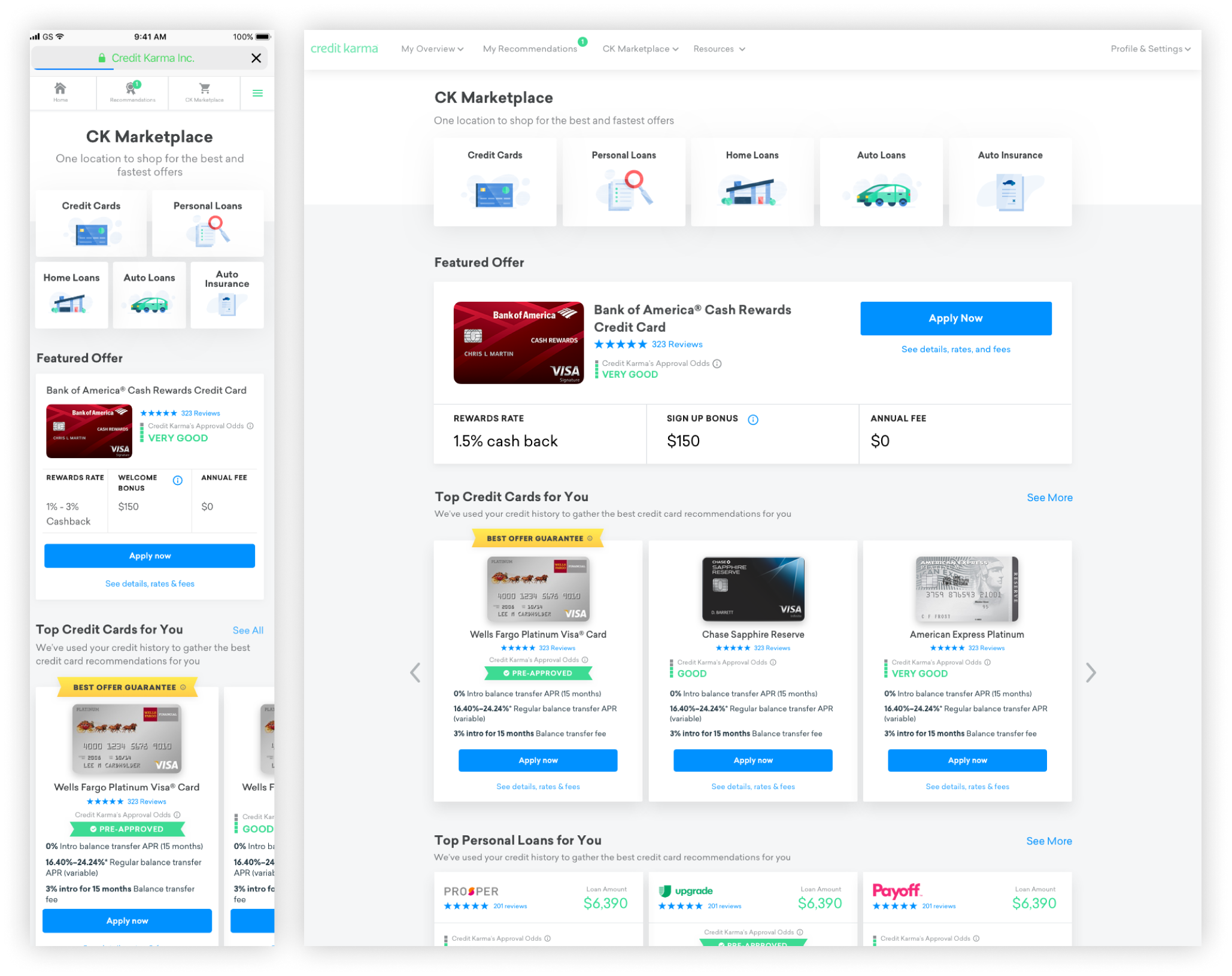
Offer Tile System & Information Architecture
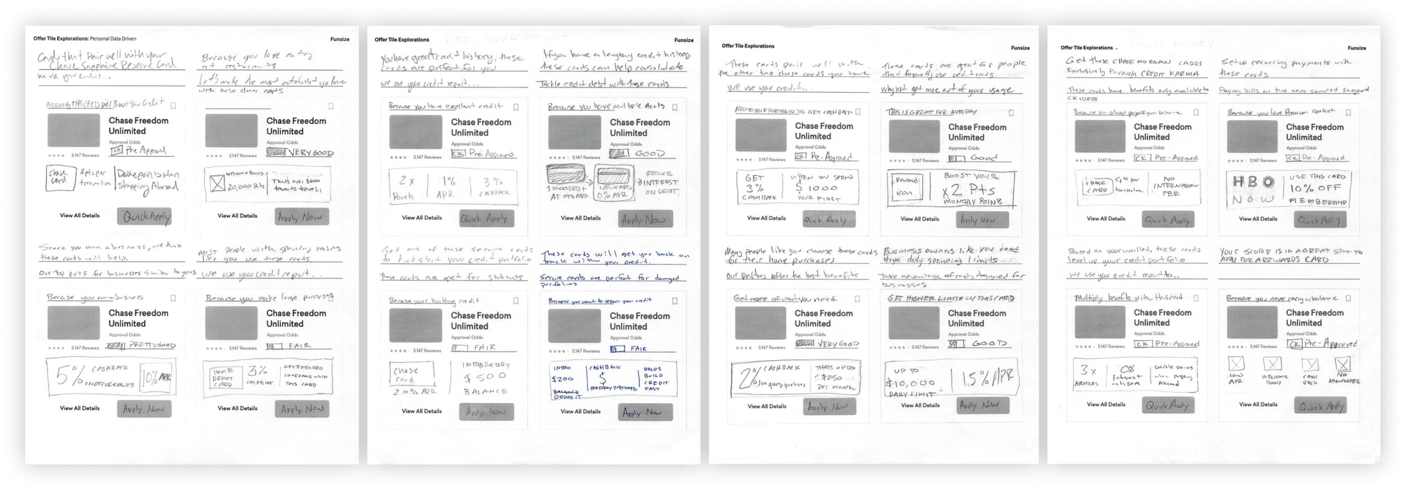
The offer tile became the foundation of Marketplace — a modular system designed to adapt based on data, context, and user intent.
We explored three primary models:
1. Personal Data–Driven Offers
Grounded in the member’s credit history, wallet composition, and spending behavior.
- Pre-qualification / pre-approval status
- Current cards in wallet
- Spending and usage patterns
2. Community-Driven Signals
Leveraging aggregate member behavior.
- “Cardholders’ Choice”
- Popular among members with similar credit profiles
- Review sentiment and usage patterns
3. Contextual Generic Offers
Used when deeper personalization wasn’t available.
- Clear benefit framing
- Real-world examples
- Reduced cognitive load
This structure allowed Marketplace to scale across credit cards, personal loans, auto loans, and insurance without fragmenting the experience.
UX Exploration: Writing the Conversation
A significant portion of the work was UX writing and narrative framing, not just layout.
We explored how to:
- Explain why an offer was recommended
- Reinforce positive financial behavior
- Warn users without creating fear or friction
Copy was written conversationally:
- “Keep doing this”
- “You might want to slow down here”
- “This could help if your goal is…”
The experience felt less like a marketplace and more like embedded financial coaching.
Final Product Experience
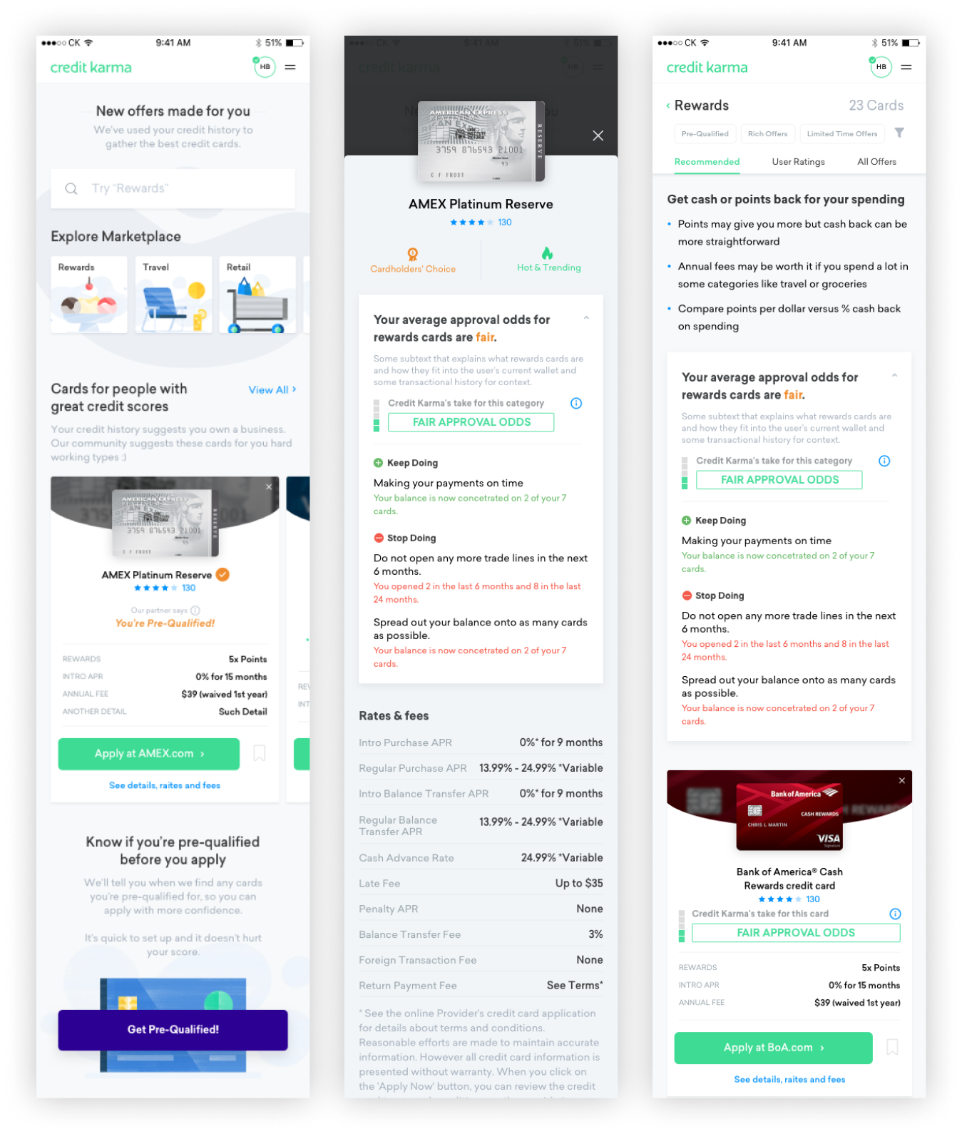
The final Marketplace experience unified multiple product categories into a single system:
- Category-based entry points (cards, loans, auto, insurance)
- Featured offers with approval odds
- Personalized recommendation carousels
- Consistent interaction patterns across desktop and mobile
Most importantly, members could act with confidence:
- Knowing their likelihood of approval
- Understanding tradeoffs
- Seeing how decisions affected their financial health
Impact & Takeaways
Marketplace helped shift Credit Karma from a credit monitoring tool to an active financial decision platform.
Key takeaways from the project:
- Transparency outperforms persuasion in fintech
- Personalization must be explainable to earn trust
- Design systems enable both clarity and scale
- UX writing is as critical as visual design
Marketplace wasn’t just about shopping for financial products — it was about reducing anxiety at moments where financial decisions feel overwhelming.
Case study based on work completed in 2018.