Teamwork Online is the go-to platform for hosting and discovering jobs in sports. One of the oldest and strongest online platforms of it's kind, I partnered with President and CEO Buffy Filippell to increase paid profile conversion, develop new back-end tools for sports teams, and use digital product to help candidates find jobs during a global pandemic.
We've collaborated together for nearly two years running user research workshops, crafting high-impact prototypes, and developed a ton of landing pages. I utilized several design processes, some of which I've highlighted here to hit Buffy's business goals. I've gathered material below for two of my favorite projects we collaborated on.
Teamwork Online has a rich history and the design language has only just recently started to evolve. As such, there were a lot of constraints in place and all design decisions had to be validated by real user feedback. The work is a result careful and thoughtful improvements.
Candidate Dashboard
Problem: How Can We Help Candidates Self-Qualify?
One of the major benefits of using Teamwork Online is the access to its founder, Buffy Filippell. If you're in the sports business, chances are you know her either personally if not second-hand. Through 34 years of helping candidates find employers, Buffy has amassed a huge amount of advice that most younger folks entering the job market don't think about or understand.
One service Buffy offers is resumé consultations. Most of her feedback is simple: "if you want a certain job you had better use that job term all over your resumé". She found there were many of these "no-brainer" examples that younger candidates were missing. The design challenge seemed simple enough: how do we translate 34 years of hiring experience into a few simple web flows?
UX: Subtle Solutions
After running an audit on the current jobs feature and comparing notes with Buffy's team we landed on two variations. It's important to note that Teamwork Online doesn't host jobs, but sells job board software solutions for sports teams. Candidates can search TO for jobs which will take them to the team's job portal hosted by TO.
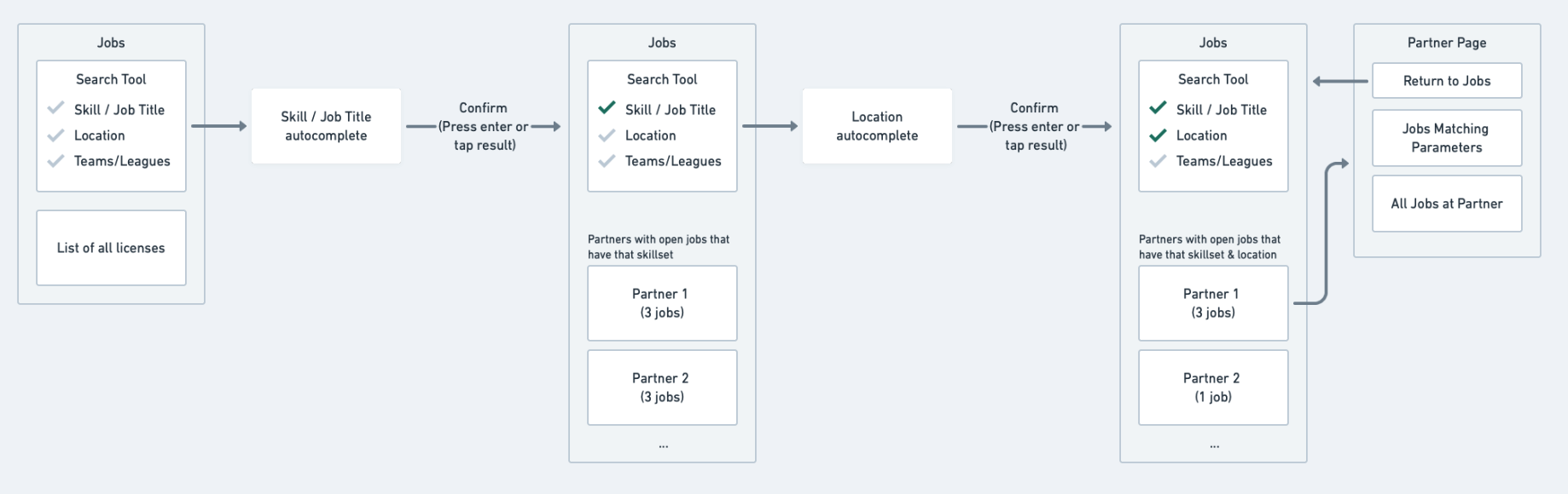
Results are filtered as a candidate fills out each search parameter.
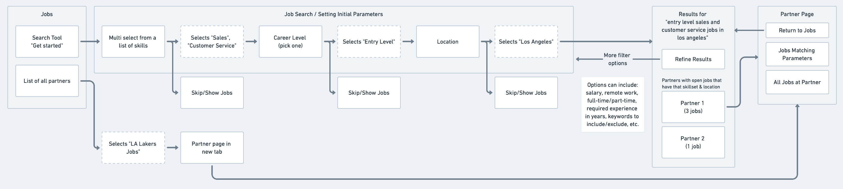
Results are served after filling out a dedicated search experience.
Figma: Component & Feature Development
There are two main services TO offers: MVP and Non-MVP. MVP service is a monthly subscription that offers additional features to help candidates find the right job for them (think LinkedIn Premium). When designing key components that make up the job browsing and candidate dashboard experience, we had to work within both of those paradigms which created a ton of permutations.
Our design system was also a design spec sheet which had multiple phases of development, testing, and redesign.
Job Modules
Each component is a series of shared and nested component styles. Updating with design changes cascades to full product.
We developed a new job feature called "Job Fitness". Using AI and a corpus of job related terms scraped from thousands of resumés, terms manually inputed by Buffy herself, and candidate notification settings, we can dynamically gauge the candidate's fitness for that given job.
Insights
Job insights is one simple solution for offering that 'Buffy-level' feedback while a candidate is browsing for jobs. One major road block candidates hit is their affinity for a specific team. Large groups of younger candidates will only apply to a single team and their experience with the product suffers when the Dallas Cowboys don't call them for an interview.
With insights, we can use candidate data to gauge application performance, job skill matching, and salary range suggestions.
Profile Check-in
Candidates are not updating their profile to reflect their current status within the job market. We found that even executives in major teams will have outdate information on their profile. This component spec is the technical mapping for each check-in point (location, salary, job types, etc.).
Typeform: User Feedback
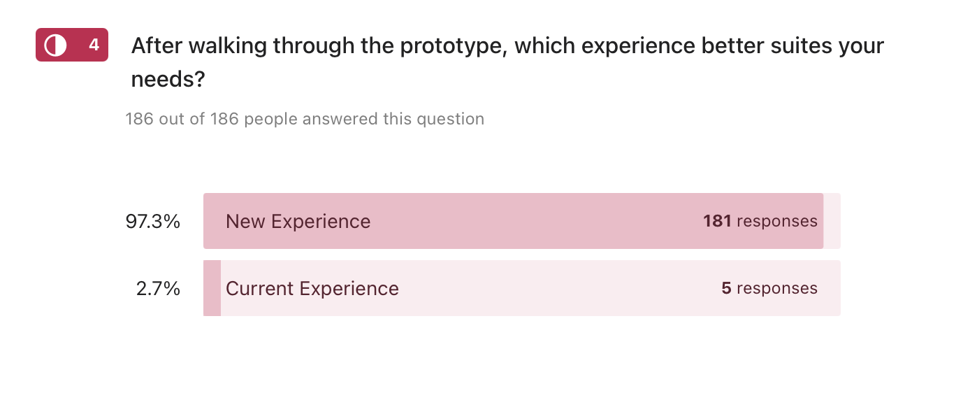
Working under tight financial constraints and minimal resources, we had to be creative with our user testing strategy. Using Typeform and embed Figma prototypes, we were able to walk users through simple qualitative questionnaires without coding a single screen.
Out of 186 responses, 181 found our design prototypes to be a significantly better experience than the current candidate dashboard at the time (97.3%). This was a huge win for us and many respondents followed up with long form responses on what they liked best and least. Using a $7 Typeform account with Figma links was a huge win for us.
Quotes from user testing
Mobile prototype question: As a Teamwork Online candidate, what do you like best about the new experience?
"The new jobs for you section and predictability meter will help me decipher which jobs are more set for my skill set. It will help me narrow in more on jobs I should be applying for. Also, knowing where I stand in terms of possibly landing a job allows myself to realize where my credentials stand amongst other competitors in the industry."
"This is much more information than the current site, particularly with its recommendations for job fit, field, and salary. It feels like a website that better coaches me to improve!"
This one didn't quite follow the prompt but it was welcomed:
"I appreciate your help in helping me conquer my dreams and I know with the newer information on the app I will be closer to getting there."
It was also insightful to hear what wasn't working
"I’m worried about the algorithm that displays the chances of me being hired wrongly discouraging some applicants"
"It looks like the page focus is only able to handle one task at a time. This is great when trying to do one item but will be harder to use if your user is trying to find multiple items."
The last suggestion had us really thinking about how our customers are going to use their profile as a passive means of job searching (user status) which we had never considered.
"Within the Candidate Profile check in it would be a nice addition to included a "seeking" portion where the candidate can place what they're specifically looking for. It is understandable that because of site mechanics. A possible solution would be implementing a review status such as: Immediately seeking, Actively seeking, Passive, Ongoing, etc.. As of right now it feels like you're paying to play a waiting game in which they may not be looking at all or will go with an internal candidate."
Figma Prototypes
Feel free to run through these prototypes yourself. Note: these were for presentation purposes and a reflective of the flows we were solving for. The design is heavily reliant on minimal development resourcing (there was a ton I wish we could have carved time for, specifically design system revamping).
Mobile Candidate Dashboard - MVP / Qualitative Test
Desktop Candidate Dashboard - MVP / Qualitative Test
MVP Landing Page
Problem
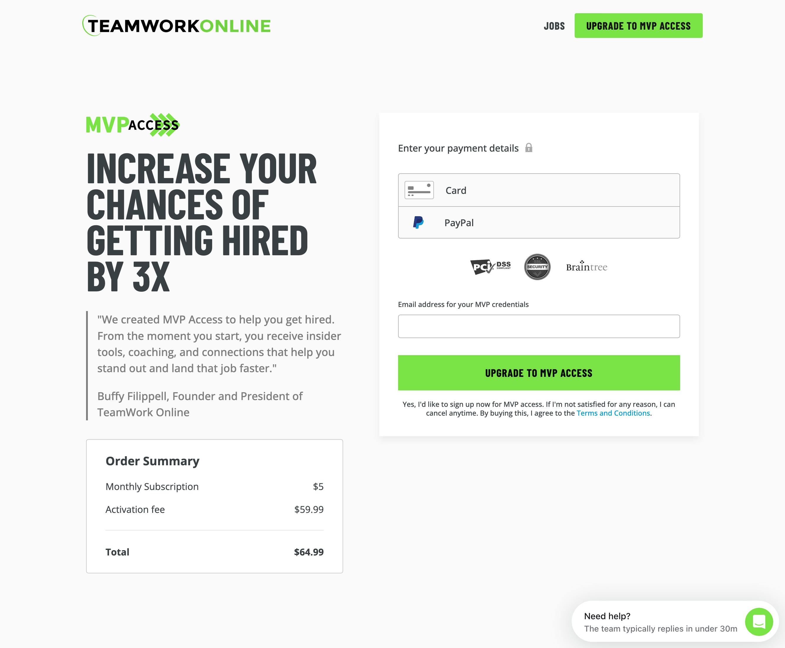
Teamwork Online's revenue generally comes from licensed partners (sports organizations that use TO job software) and job seekers who want access to premium features by way of the MVP subscription model. The old MVP marketing page was not converting well mostly due to poor layout and distracting elements.
This project was purely tactical: how do we increase MVP conversion? The process from audit to launch took 6 weeks.
UX
I opted to create a wireframe component library based off of other marketing pages throughout the platform. I made recommendations based on personal experience working on landing pages rather than run user tests. I pieced together different layout structures to figure out the right rhythm of the page and we landed on a single option.
Wireframe component library
The main offenders I sought to correct were the conflicting testimonial headlines, the MASSIVE graphic header, and the fact that the sign up form is at the bottom of the page. Given that a lot of the MVP marketing existed outside of the product (email campaigns, in-person job fairs, web advertisement) we didn't have to rely entirely on the landing page to tell customers what we were offering.
- Old landing page design
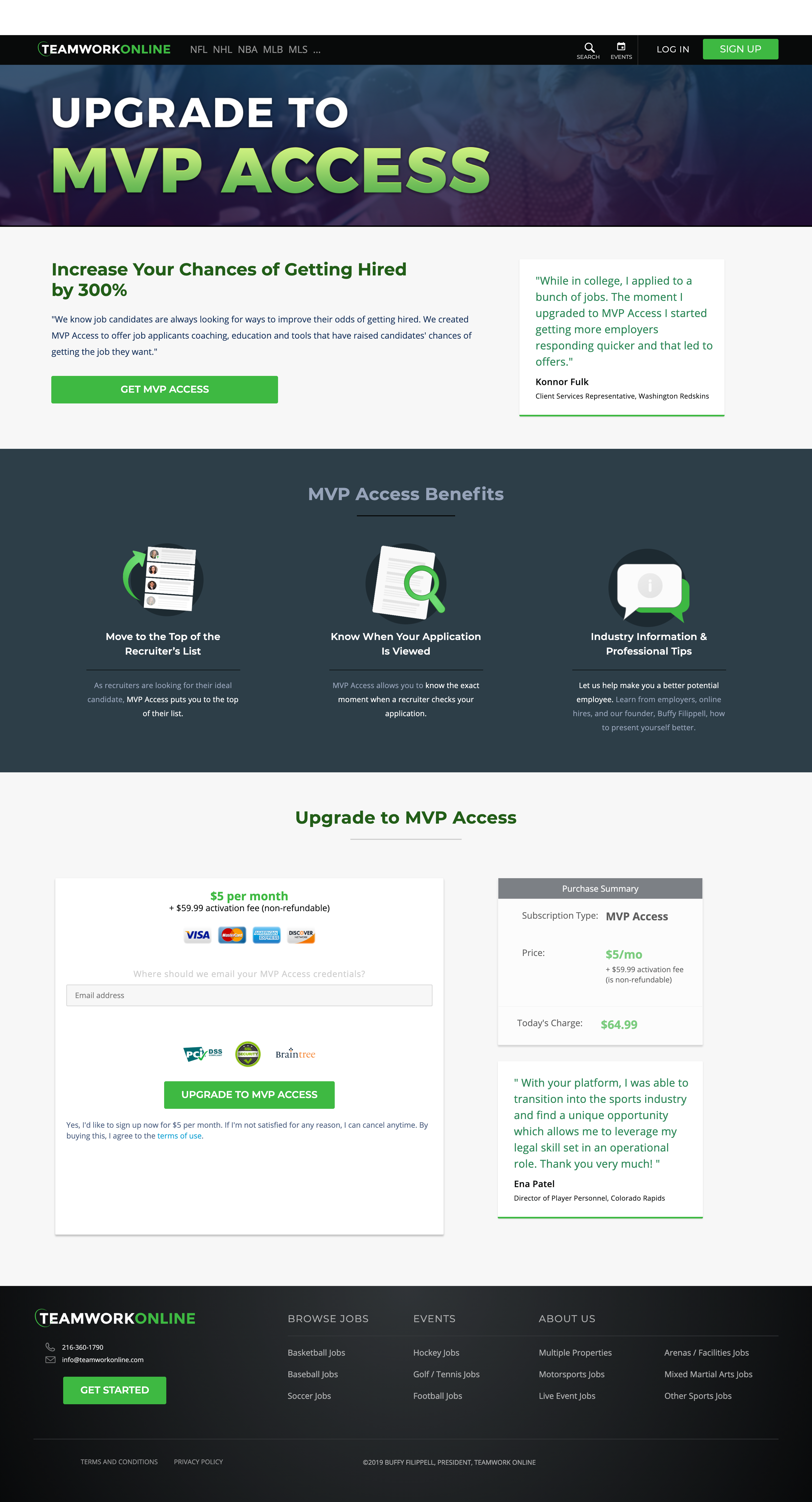
Other improvements included pairing snippets of the actual product next to feature benefits. Sometimes abstracting is useful when speaking in larger terms and in this case showing a user how their experience will change in a very real way was key for educating.
Development
For this project I skipped the design tool altogether and went straight into the browser. The web dev toolkit I created consisted of:
Bass CSS for creating modular in-line style components
Contentful for simple content management.
API-first content platform to build digital experiences
Netlify for hosting.
Netlify: Develop & deploy the best web experiences in record time
Results
After launching the new MVP landing page, MVP subscription conversion increased by 35% in the first three months. Simple design strategies like toning down imagery, wrangling content, and putting the payment form right at the top propelled a tertiary subscription service to a sales lever nearly as powerful as the main product.
Live website:
Sports Jobs - TeamWork Online's Portal to Jobs in Sports
Note: I cannot predict the content changes made by the TO internal team.