Note: I designed this product as part of my work at Funsize.
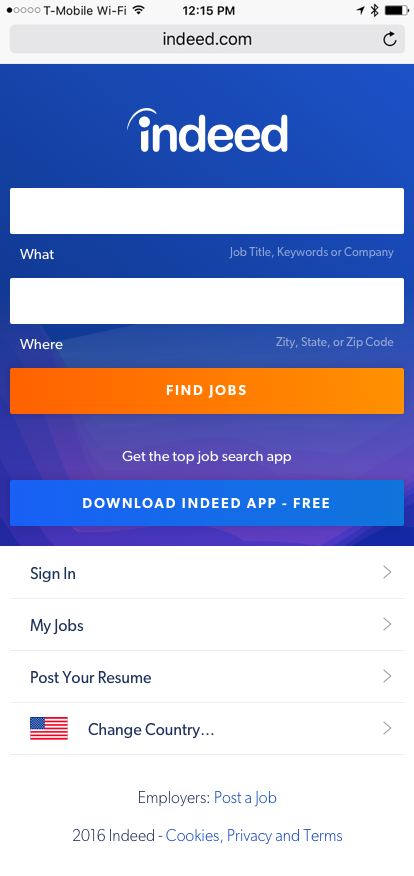
In 2016, Indeed faced a perception problem.
Despite massive adoption, the product looked and felt closer to Craigslist than a modern, trustworthy career platform. For users making high‑stakes decisions about jobs, resumes, and employers, this visual and experiential gap mattered.
My role was to reimagine Indeed’s mobile experience—not as a shippable redesign, but as a creative product exploration that asked a simple question:
What would Indeed look like if trust, clarity, and confidence were the primary design goals?
This work was never intended to be built directly. Instead, it served as a directional artifact, influencing product and creative strategy across the organization.
The Core Challenge: Trust
Job searching is deeply emotional and vulnerable:
- Users share personal information
- They evaluate life‑changing opportunities
- They need confidence in both employers and the platform itself
At the time, Indeed’s experience suffered from:
- Visual inconsistency
- Dense, web‑era layouts
- Low perceived credibility
- Minimal emotional reassurance
The challenge wasn’t usability alone—it was belief.
Design Goals
The exploratory work focused on three core goals:
1. Increase Perceived Credibility
The interface needed to feel:
- Modern
- Calm
- Intentional
- Professional without being corporate
Visual clarity was treated as a trust signal.
2. Reduce Cognitive Load
Job seekers are already overwhelmed.
The design emphasized:
- Clear hierarchy
- Fewer competing actions
- Strong typographic rhythm
- Predictable navigation patterns
The experience guides users instead of confronting them.
3. Signal Care and Competence
Small details matter when users are anxious:
- Clear error states
- Gentle validation
- Thoughtful spacing
- Human‑centered copy tone
The product needed to feel like it was on the user’s side.
Key Explorations
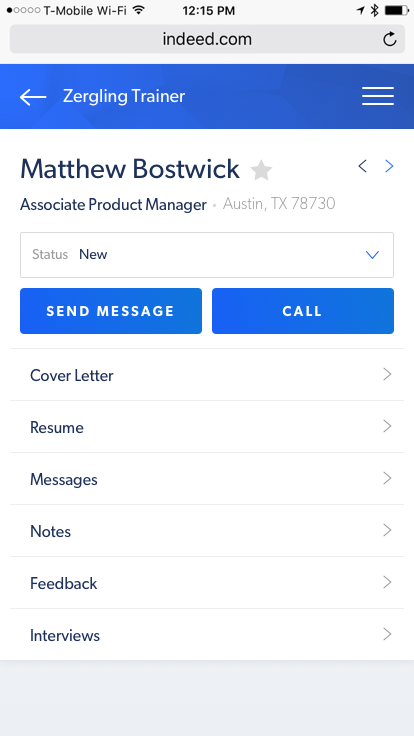
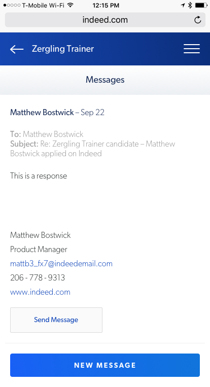
Candidate Details
The candidate view was rethought to feel:
- Structured
- Respectful of personal data
- Easy to scan without reducing people to fields
This reframed candidates as individuals—not rows in a database.
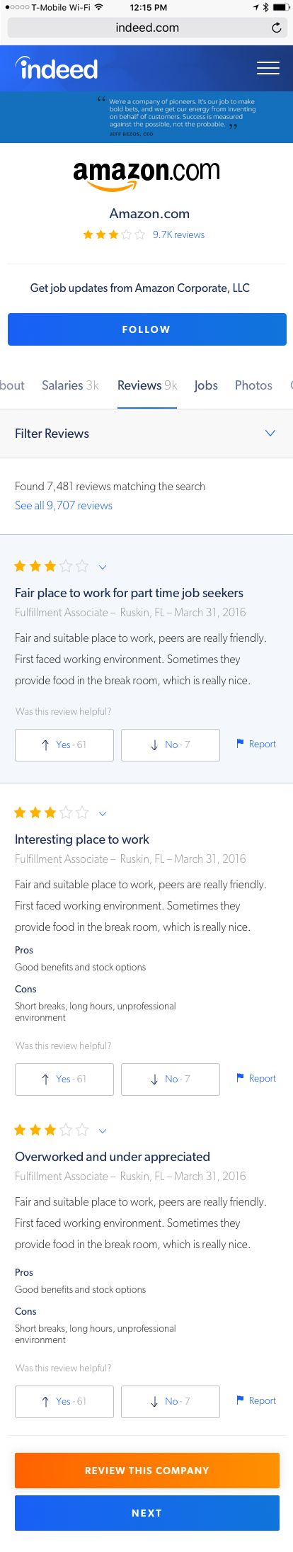
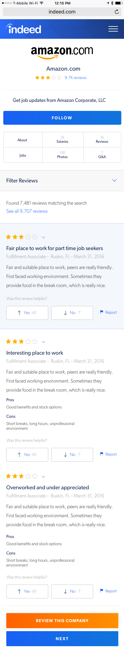
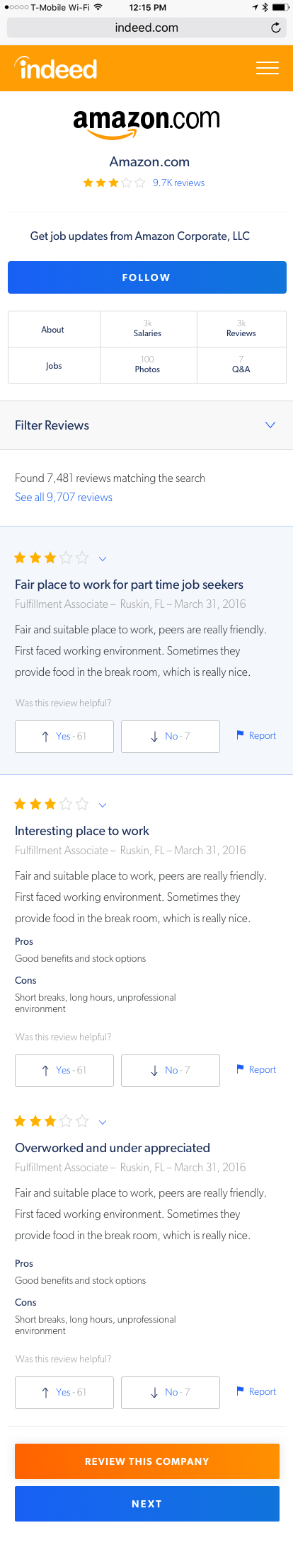
Company Reviews
Company reviews were redesigned to emphasize:
- Legibility over density
- Consistent presentation across companies
- Reduced visual noise from branding
In some explorations, company banners were intentionally removed to keep focus on content over marketing.
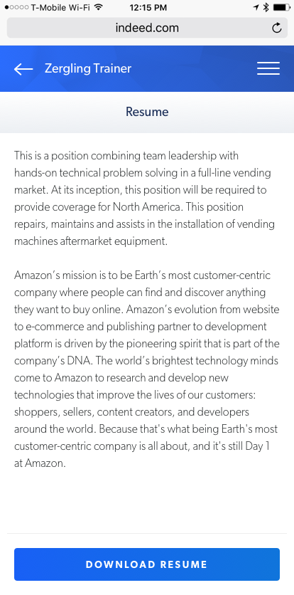
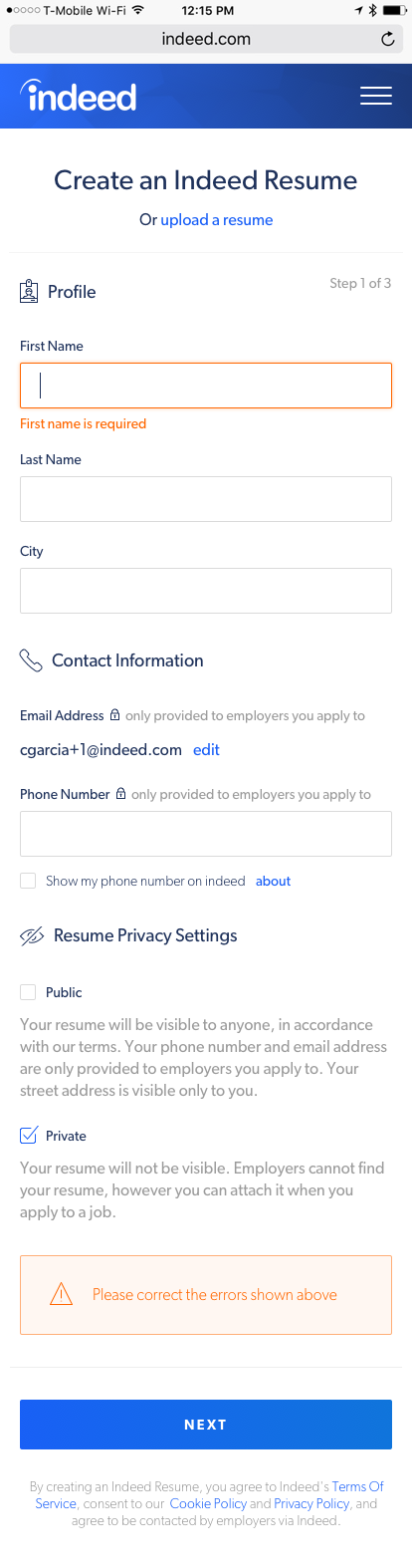
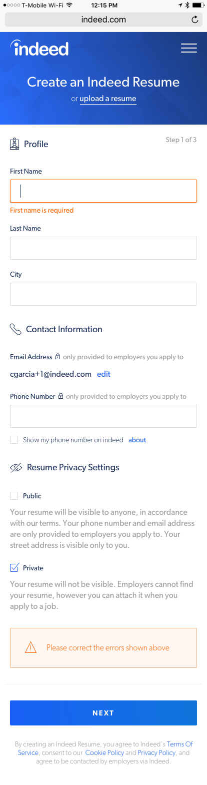
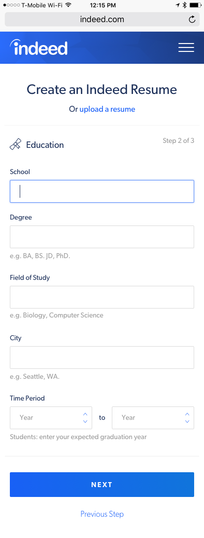
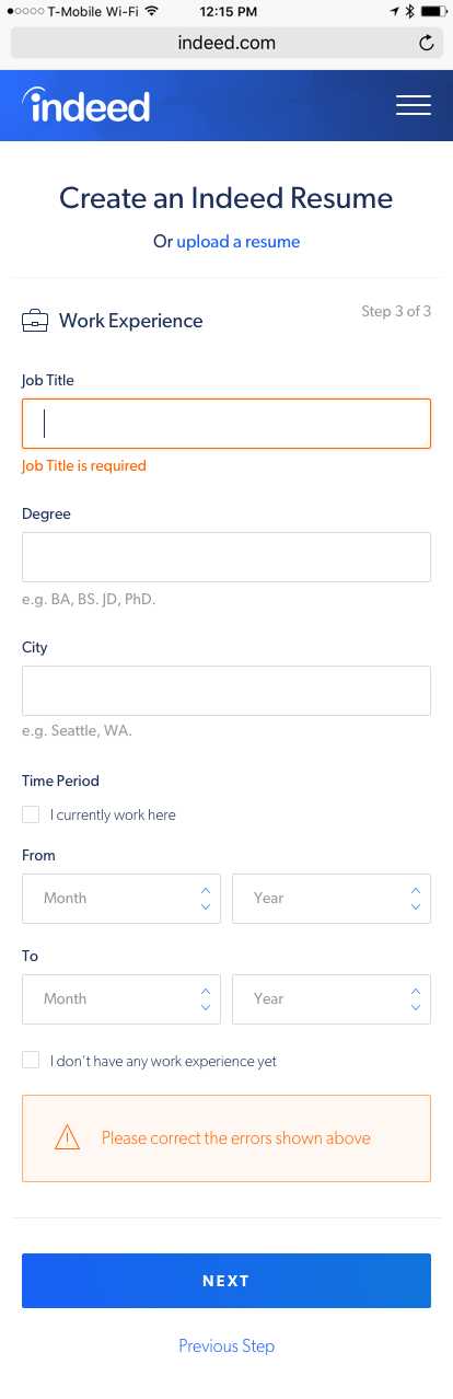
Resume Creation
Resume creation is one of the most anxiety‑inducing moments in job searching.
The redesigned flow focused on:
- Step clarity
- Immediate feedback
- Reduced form intimidation
- Clear privacy signaling
Errors are framed as guidance—not failure.
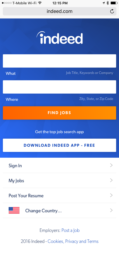
First‑Time Experience
The first‑time home experience was designed to:
- Explain value quickly
- Set expectations clearly
- Encourage exploration without pressure
Instead of throwing users into search immediately, the experience establishes context and reassurance.
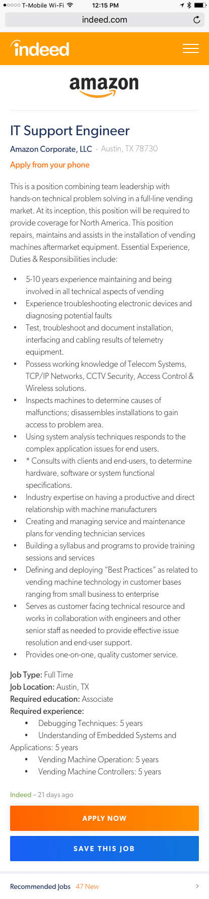
Job Search & Details
The job search and details screens were reimagined to provide clear, scannable information while reducing visual clutter.
Why This Wasn't Meant to Ship
This work wasn’t a proposal for a single redesign.
It was:
- A north star
- A conversation starter
- A way to visualize what “trust” could look like at scale
Exploratory design like this creates shared language across design, product, and leadership—without the constraints of immediate feasibility.
Impact
While none of these screens shipped directly, the work:
- Influenced visual and interaction direction
- Helped shift internal conversations around trust and perception
- Contributed to a broader move away from web‑2.0 aesthetics
- Clarified the role of design in shaping user confidence
Sometimes the most valuable design work isn’t what launches—it’s what changes how teams think.
What I Took Away
- Trust is a design material, not a feature
- Restraint can be more powerful than novelty
- Exploratory work has real impact when framed clearly
- Designing for belief requires empathy, not polish alone
Closing Thoughts
Reimagining Indeed reinforced an idea I still return to often:
Products don’t earn trust by asking for it—they earn it by how they behave.
This project wasn’t about pixels for production. It was about showing what care could look like in a system used by millions at pivotal moments in their lives.