Note: I designed this product as part of my work at Funsize.

While native apps allow for deep control over the writing environment, the Grammarly Chrome extension posed a very different—and uniquely challenging—design problem:
how do you support better writing everywhere, without owning the surface you’re writing on?
My role was to help design Grammarly’s Chrome extension as a lightweight, trustworthy layer that works across millions of websites, text fields, and writing contexts—while staying out of the writer’s way.
The Challenge of the Open Web
Unlike a native editor, a browser extension has almost no guarantees:
- Every site behaves differently
- Text fields range from simple inputs to rich editors
- Performance budgets are tight
- Visual intrusion breaks trust immediately
The core challenge wasn’t just accuracy—it was restraint.
Grammarly had to:
- Appear when helpful
- Disappear when not
- Respect the host page’s design
- Work consistently across wildly inconsistent environments
Core Design Principles
1. Ubiquity Without Ownership
The extension doesn’t “own” the page. It borrows just enough space to help, then gives it back.
No permanent panels.
No hijacked layouts.
No visual dominance.
The UI adapts to the host environment rather than competing with it.
2. Progressive Disclosure of Feedback
Writing feedback unfolds in layers:
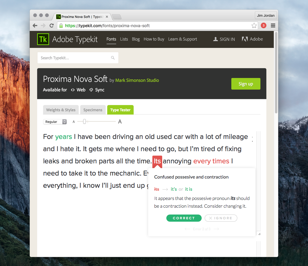
- Inline highlights signal potential issues
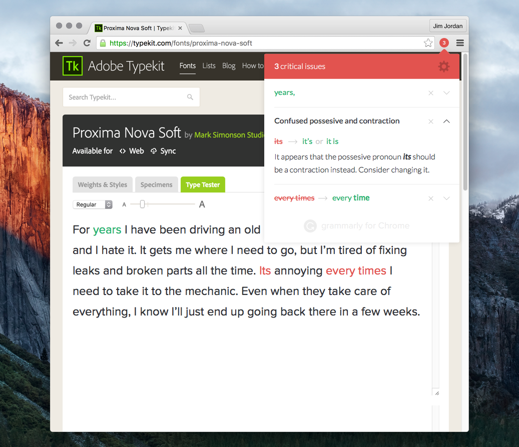
- Contextual cards explain suggestions only when engaged
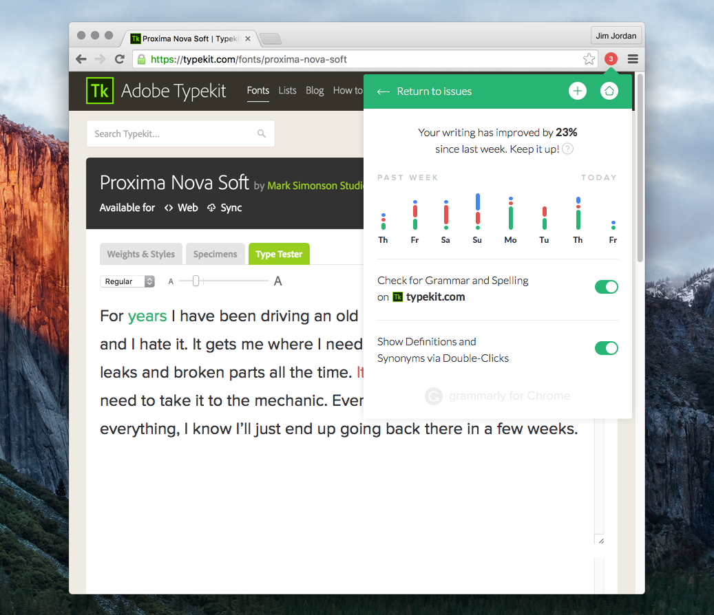
- Expanded views summarize progress and settings
This ensures writers aren’t overwhelmed—and can choose how deep they want to go.
3. Cursor- and Selection-Aware Interactions
Just like in native experiences, the Chrome extension is designed around where attention already is:
- Suggestions anchor to the relevant word or phrase
- Cards appear close to the text, not in distant panels
- Actions are reversible and low-risk
Writers never lose their place.
Handling Free vs Paid Experiences
One of the more nuanced design challenges was supporting both free and paid users without creating friction or resentment.
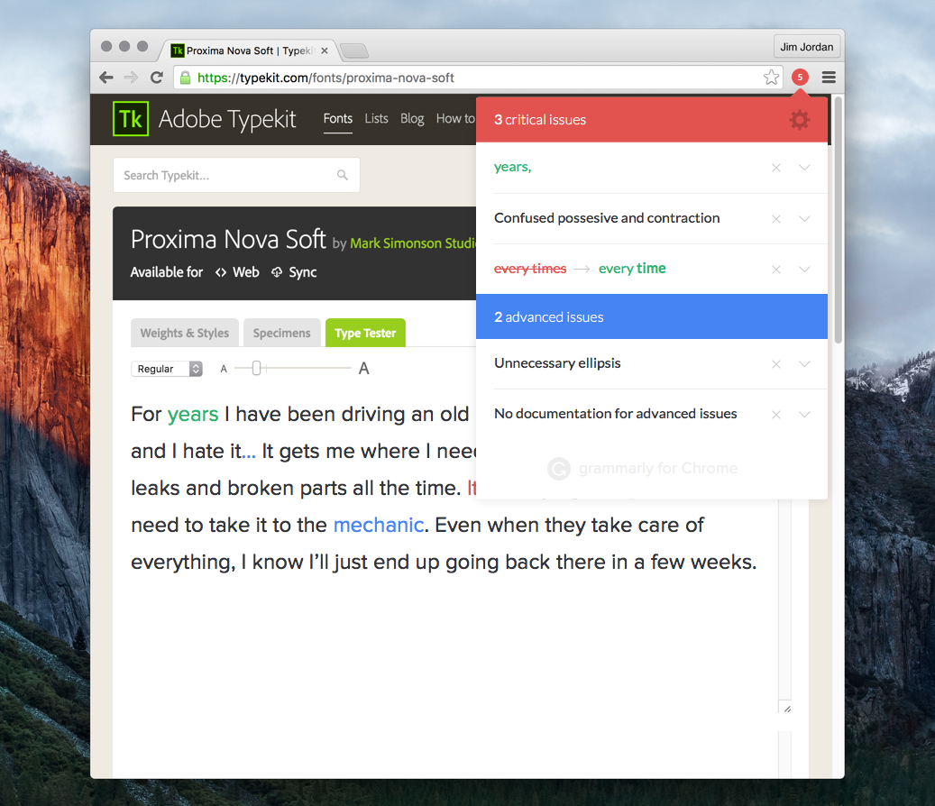
- Free users receive meaningful, actionable improvements
- Advanced suggestions are clearly labeled—not hidden
- Unsupported suggestions explain why they’re unavailable
This transparency helps maintain trust while still communicating value.
Communicating Progress & Motivation
Beyond corrections, the extension also reinforces improvement over time.
- Lightweight writing stats
- Weekly progress indicators
- Positive reinforcement without gamification overload
The goal isn’t to score writing—it’s to encourage momentum.
Onboarding & Trust
Installing a writing assistant into your browser is an act of trust.
The onboarding experience was designed to:
- Clearly explain what Grammarly does (and doesn’t do)
- Emphasize privacy and control
- Let users opt into features incrementally
Trust, once broken, is almost impossible to regain—so clarity mattered more than persuasion.
Designing for Constraints
Some of the most important design decisions came from constraints:
- Limited screen real estate
- Performance sensitivity
- Inconsistent DOM structures
- Accessibility requirements across unknown sites
These constraints forced the system to be:
- Modular
- Resilient
- Predictable
And ultimately, better.
What I’m Most Proud Of
- Designing an experience that works everywhere, not just ideal cases
- Making feedback feel helpful, not judgmental
- Balancing visibility with restraint
- Supporting millions of writers without interrupting their flow


Closing Thoughts
Designing the Grammarly Chrome extension reinforced a belief I hold deeply:
The best tools don’t demand attention—they earn it.
On the open web, where nothing is guaranteed and everything is fragile, helping writers means knowing when to show up—and when to quietly step aside.