Note: I designed this product as part of my work at Funsize.
 During my time working with Grammarly, I focused on designing a native, cross-platform writing experience built around Grammarly’s writing-checking system at its core. The goal was simple but ambitious: make Grammarly feel invisible—present everywhere writers need help, without interrupting flow.
This work spanned macOS, iOS, and iPadOS, and required close collaboration between design, engineering, and platform teams to ensure performance, consistency, and deep OS integration.
The Design Challenge
Most writing tools treat grammar and clarity checks as an overlay—something that sits on top of text. My role was to rethink that model and design an experience where:
- Writing assistance feels native, not bolted on
- Feedback appears in context, not in modal interruptions
- The system scales from phone to tablet to desktop
- Writers stay in flow, even while revising heavily
This meant designing not just UI, but interaction models, cursor behavior, selection mechanics, and document structure.
Core Principles
1. Writing First
The interface prioritizes text above everything else. Controls fade away when not needed, and the system avoids persistent chrome that competes with the writing surface.
2. Feedback Without Friction
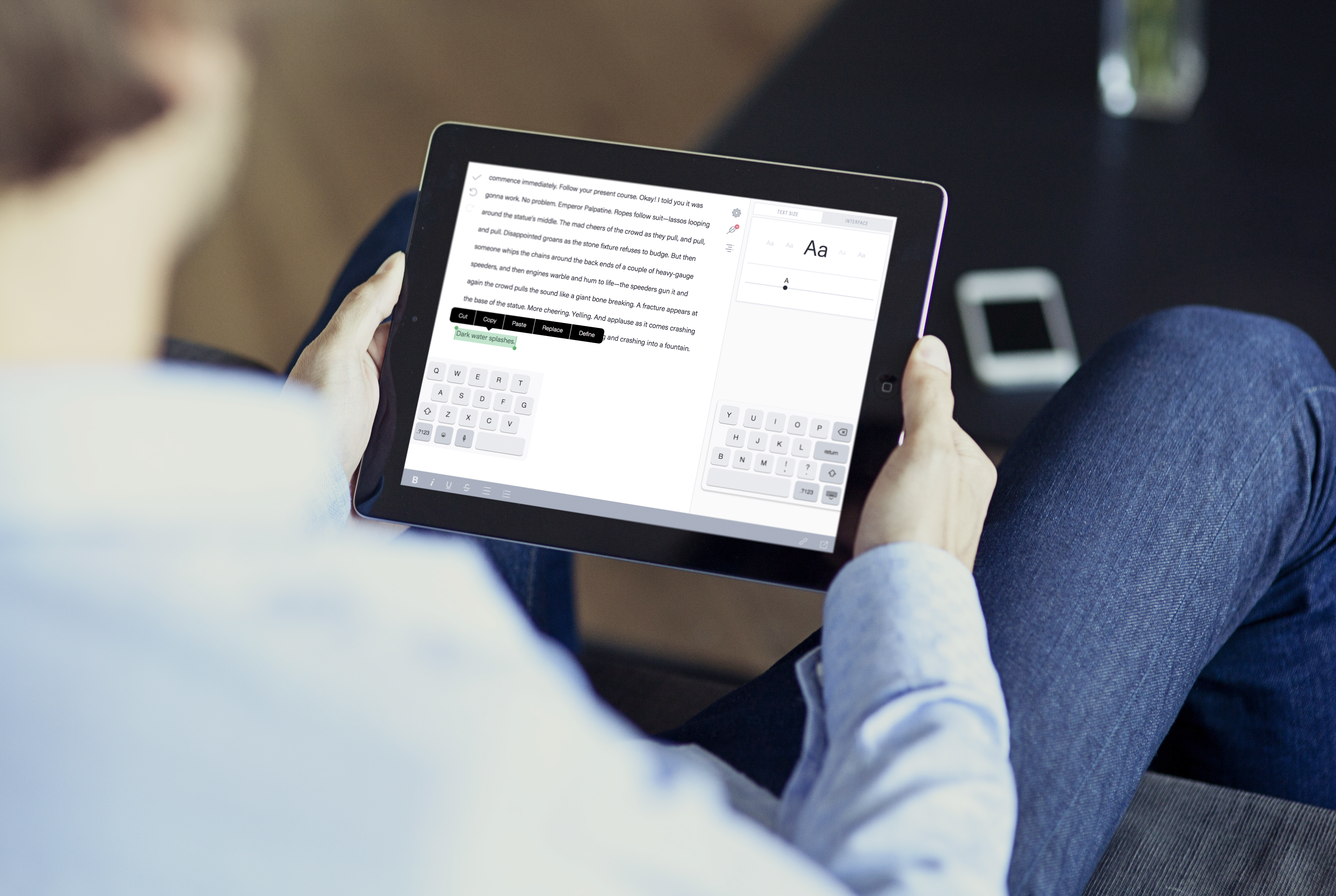
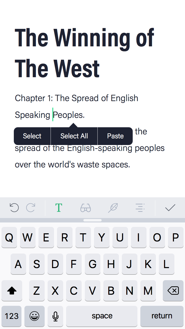
Grammarly suggestions are integrated directly into the editing experience—surfacing at the cursor, within selections, or contextually nearby, rather than pulling users away into side panels.
3. Platform-Native Behavior
Each platform follows its own conventions:
- macOS embraces keyboard-driven workflows and windowed layouts
- iOS optimizes for touch, selection handles, and compact controls
- iPadOS bridges both, supporting multitasking and split views
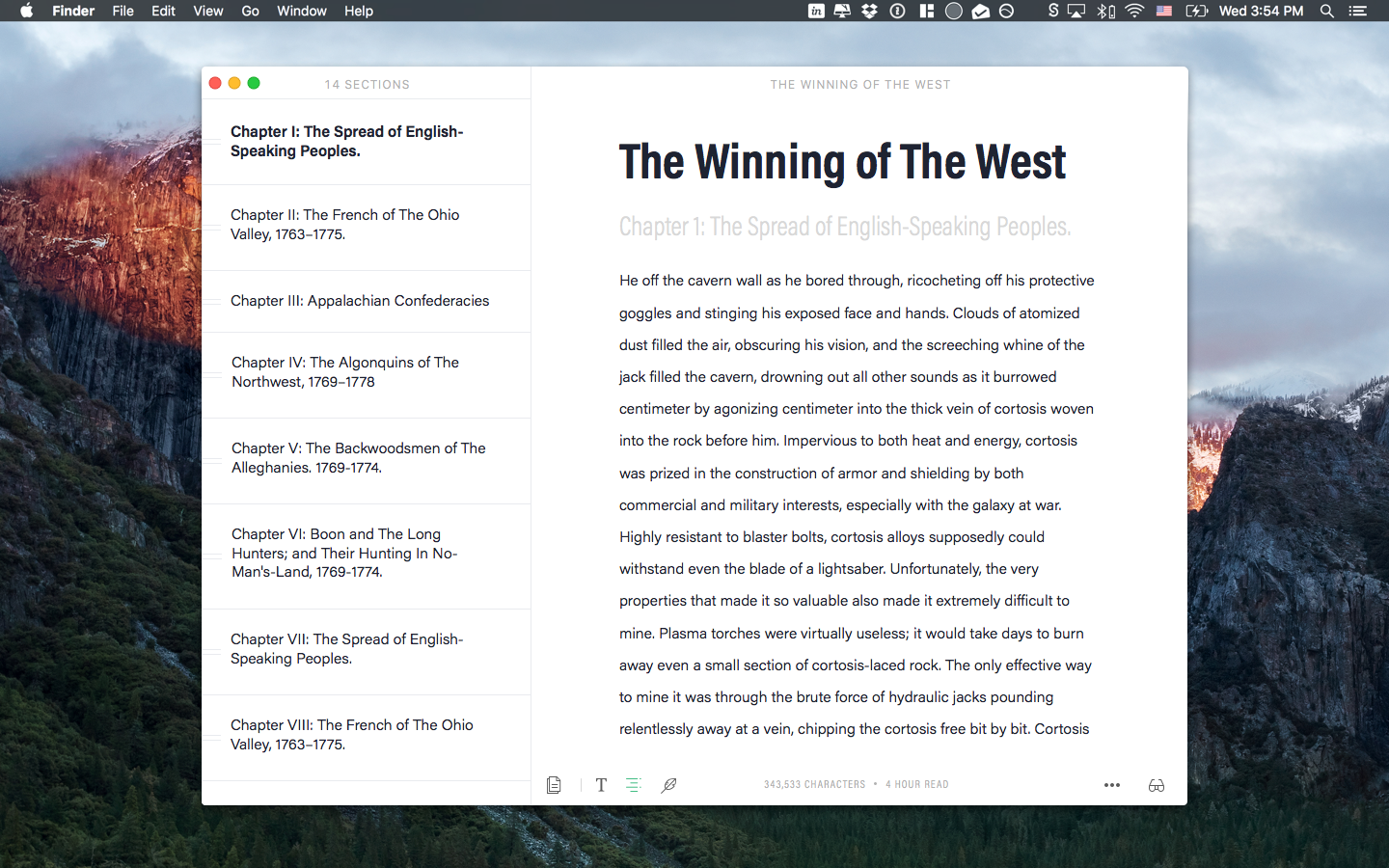
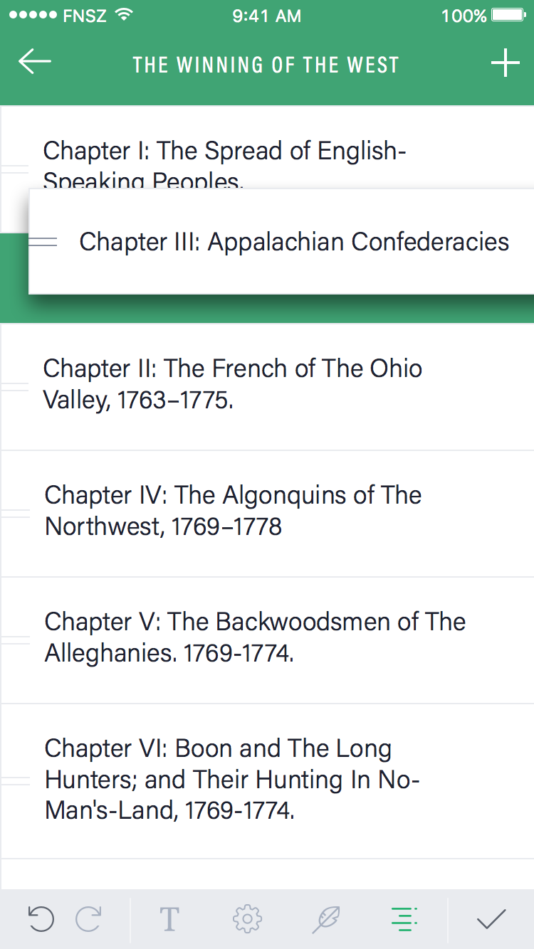
Document Structure & Navigation
Long-form writing demands strong structure. I designed a dynamic table of contents that allows writers to:
- Navigate large documents instantly
- Reorder sections with drag-and-drop
- Maintain orientation without breaking focus
The TOC adapts to screen size and input method, working equally well with mouse, keyboard, and touch.
Cursor-Centric Editing
A major focus was designing around the cursor, not panels or buttons.
- Suggestions appear where attention already is
- Selection actions are contextual and lightweight
- Editing tools stay anchored to text, not screen edges
This approach reduces cognitive load and makes Grammarly feel like a natural extension of writing itself.
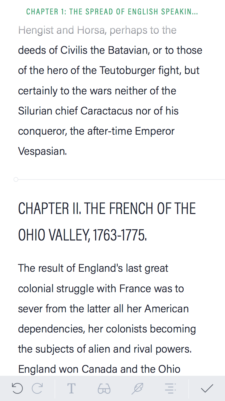
Writing Modes & Focus
To support different writing states, I designed multiple writing modes, including a focus mode that minimizes distractions and emphasizes rhythm and flow.
- UI elements fade intelligently
- Typography and spacing adapt to reading vs writing
- Writers can move seamlessly between drafting and revising
!
Cross-Device Consistency
Designing for macOS, iPhone, and iPad meant thinking in systems, not screens.
- Shared interaction patterns, adapted per platform
- Consistent Grammarly feedback behavior everywhere
- Layouts that respond to size classes and orientation
The result is an experience that feels cohesive, whether you're editing a paragraph on your phone or revising a chapter on a Mac.
What I’m Most Proud Of
- Making Grammarly feel built-in, not layered on
- Preserving writer flow while delivering powerful feedback
- Designing systems that scale from short notes to long manuscripts
- Bridging platform conventions without compromising consistency
Closing Thoughts
Writing tools succeed when they disappear. This project pushed me to think deeply about attention, interruption, and craft—how software can support writing without demanding it.
Designing this native Grammarly experience reinforced my belief that the best productivity tools don’t shout. They whisper—right when you need them.