Note: I designed this product as part of my work at Funsize.
In 2015, most HR software looked and behaved the same.
Tools like Workday were powerful but impersonal. Internal directories were static. Employee data lived in systems that felt designed for compliance—not people. Even when companies cared deeply about culture, their tools rarely reflected it.
Pingboard set out to be different.
My role was to help design Pingboard’s mobile experience—particularly on Android—at a time when human-centered HR software wasn’t yet the norm. The goal wasn’t just to store employee information, but to help teams understand who they work with.
The Context: HR Software in 2015
This work predates:
- Modern people platforms
- Culture-forward internal tools
- The expectation that workplace software should feel friendly
At the time, HR apps were:
- Dense
- Administrative
- Optimized for managers, not employees
Pingboard’s opportunity was to treat people as the product, not records.
Core Design Philosophy
1. People, Not Profiles
The design centered on identity, not metadata.
Profiles emphasized:
- Faces first
- Names, roles, and teams over IDs and fields
- Personal details that encouraged recognition and connection
The intent was simple:
If you can recognize someone, you’re more likely to collaborate with them.
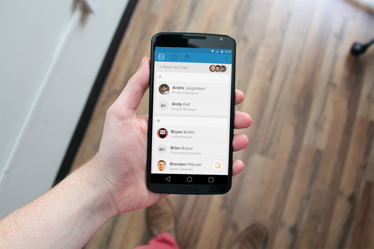
2. Mobile as a First-Class Experience
This wasn’t a companion app—it was a primary surface.
Employees needed quick answers:
- Who’s on my team?
- How do I contact them?
- Who’s working remotely?
- What’s happening today?
The Android app was designed for fast, glanceable interactions, not long sessions.
3. Lightweight Interaction Over Enterprise Heaviness
Enterprise software often equates seriousness with complexity.
Pingboard intentionally pushed back:
- Clear hierarchy
- Generous spacing
- Simple navigation
- Minimal configuration
The UI avoids feeling “official” while still being dependable.
Key Experience Areas
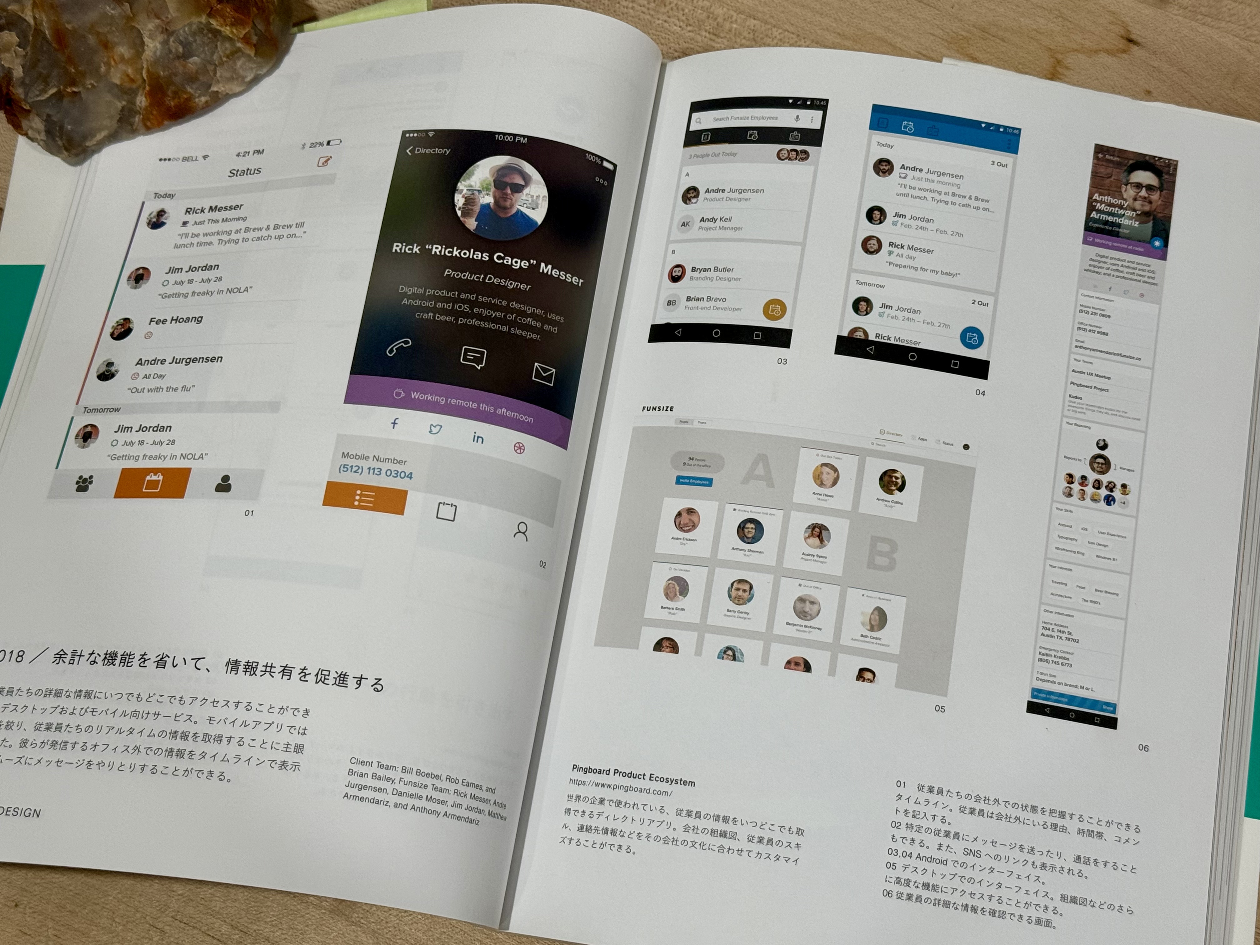
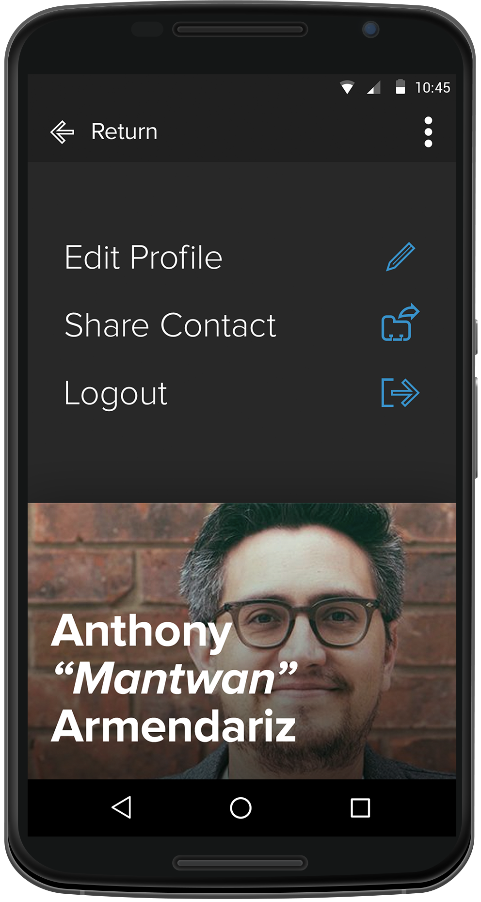
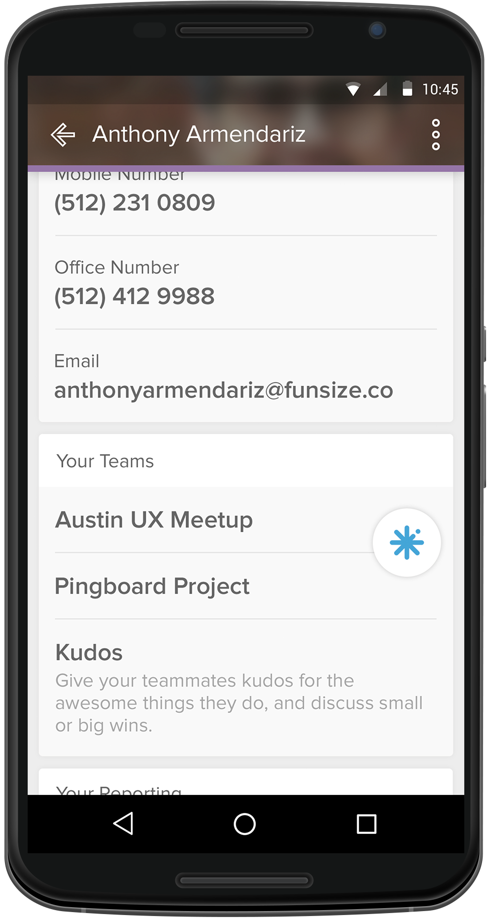
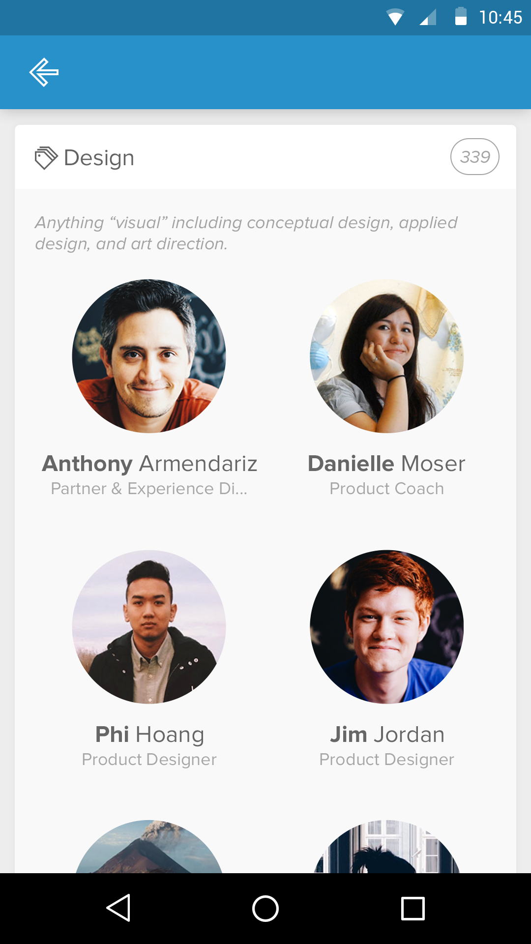
Profile Dashboard
The profile view was treated as the heart of the product.
It combines:
- Identity
- Availability
- Context (role, team, location)
- Personal signal without oversharing
Actions like contacting or "pinging" someone are kept close to the person—not buried in menus.
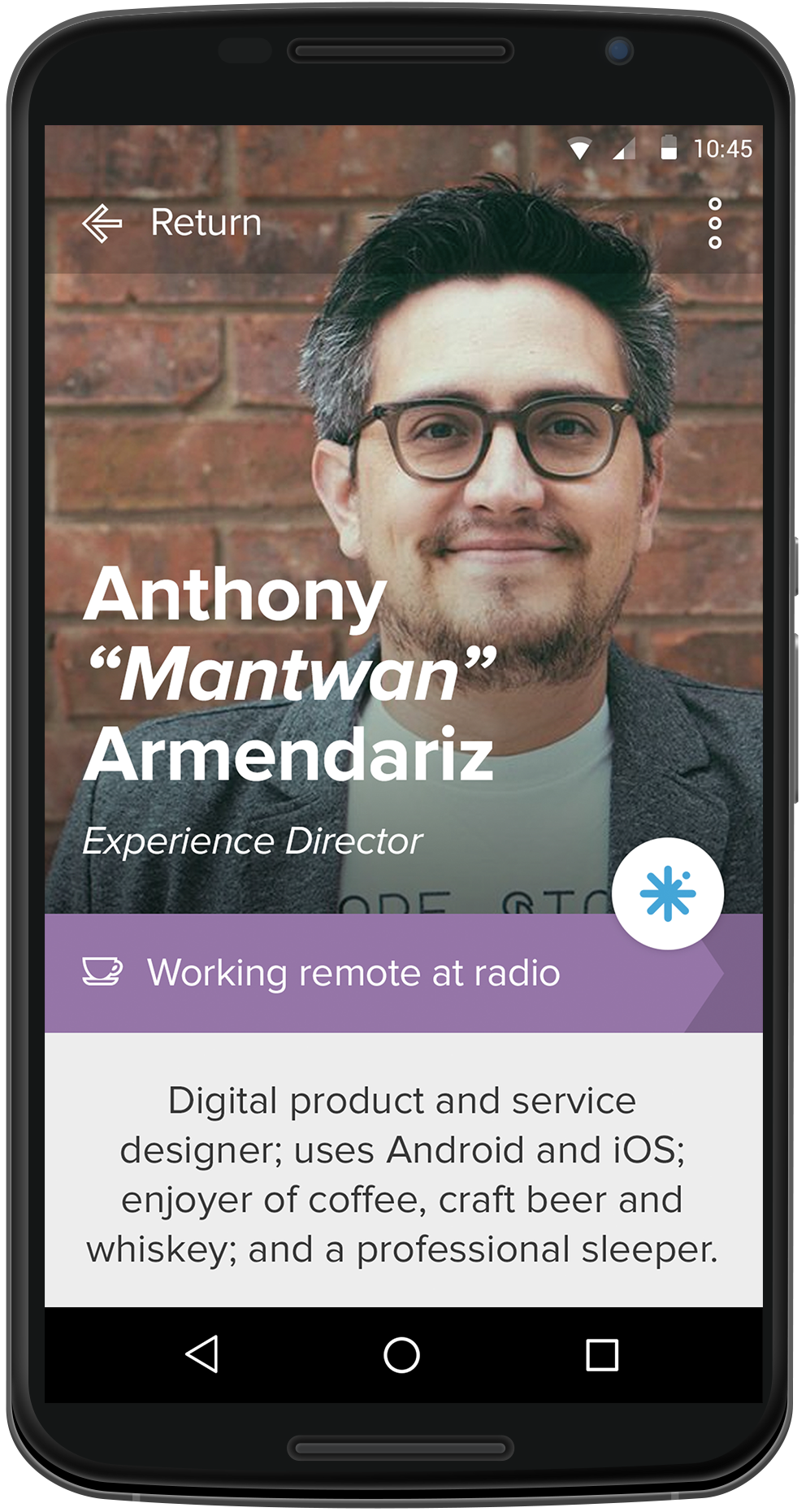
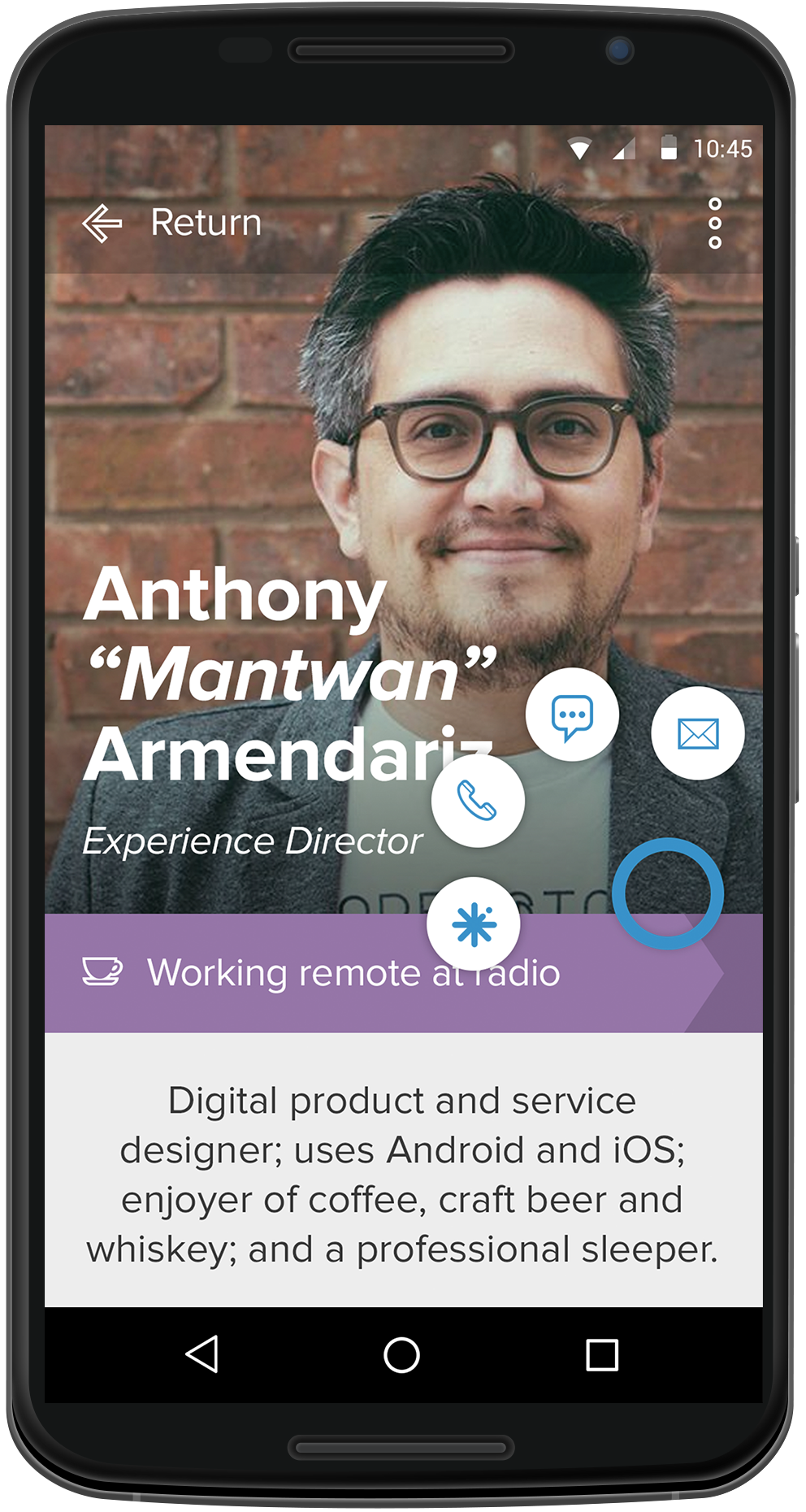
Presence & Availability
Subtle signals—like whether someone is remote—were designed to be:
- Immediately visible
- Non-intrusive
- Socially informative
These cues help teams coordinate without requiring explicit messaging.
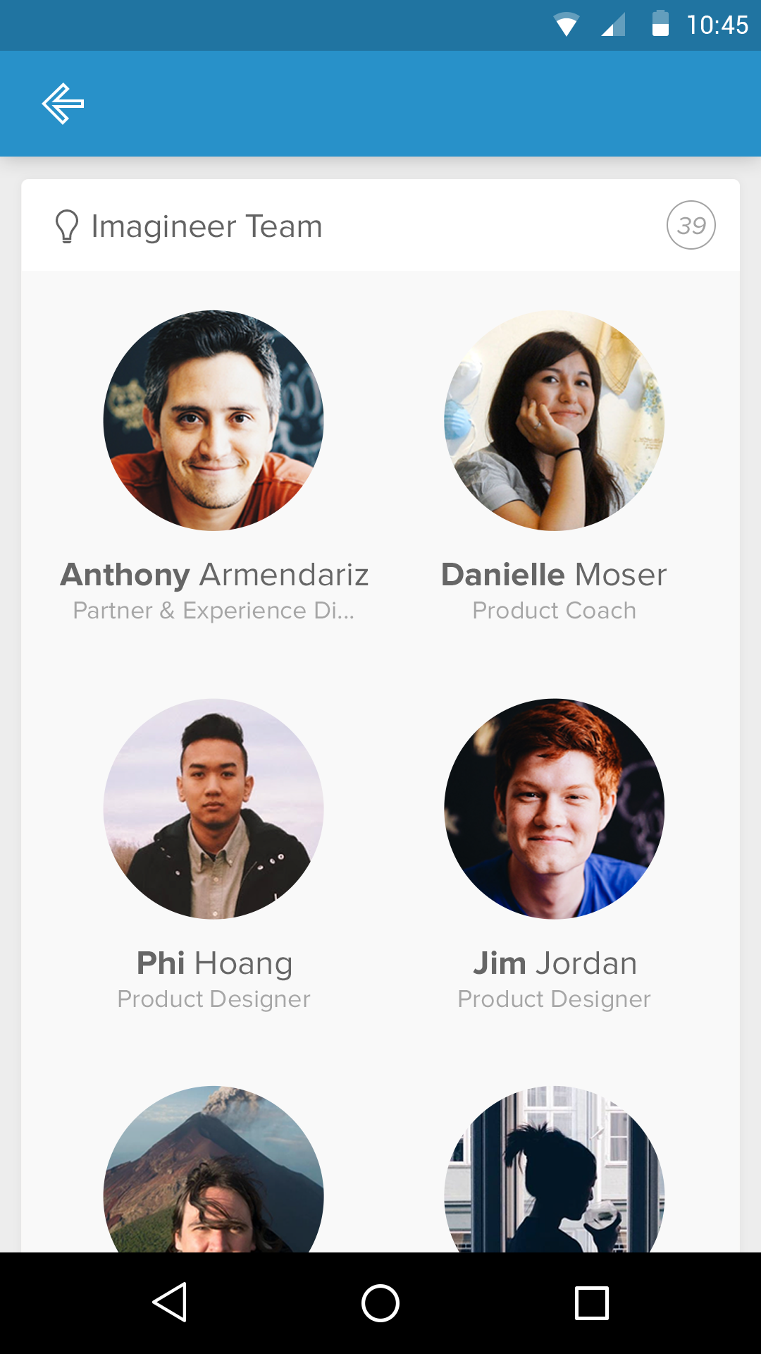
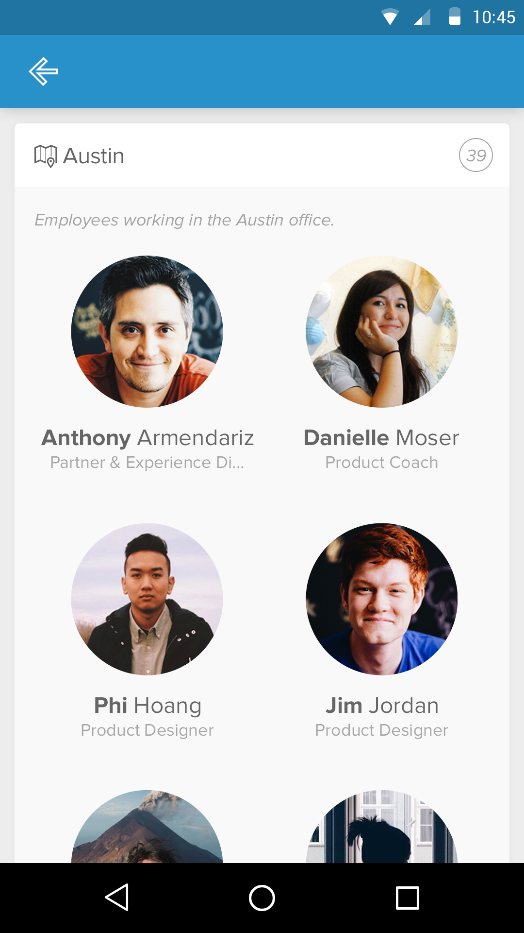
Team Views
Teams were presented visually, not hierarchically.
The goal was to:
- Make team composition obvious at a glance
- Reinforce belonging
- Reduce the friction of finding the right person
This supported both onboarding and day-to-day collaboration.

Designing for Culture, Not Just Function
One of the most important aspects of this work was tone.
Copy, spacing, motion, and imagery were all used to signal:
- Approachability
- Trust
- Humanity
HR software touches sensitive parts of people’s work lives. The product needed to feel safe, friendly, and respectful.
Constraints & Tradeoffs
Designing in 2015 meant working within:
- Early Android material patterns
- Smaller screens
- Less mature design systems
- Limited expectations for polish in internal tools
These constraints pushed the design toward clarity and restraint, rather than visual flourish.
What This Work Represented
Pingboard wasn’t trying to replace heavy HR systems.
It was carving out a new space:
- A social layer for organizations
- A living directory
- A reflection of company culture
In many ways, it anticipated where internal tools would eventually go.
What I’m Most Proud Of
- Designing HR software that felt human before it was expected
- Treating employees as people, not rows in a table
- Creating a mobile-first experience for internal tools
- Balancing friendliness with trustworthiness
Closing Thoughts
Pingboard reinforced a lesson that’s stayed with me:
Internal tools shape culture as much as policies do.
By designing with empathy—especially in spaces traditionally dominated by bureaucracy—we can create systems that help people feel seen, connected, and supported at work.
Publication
This work was featured in UI Graphics: Beautiful User Interface Design for the Smartphone Age, a Japanese UI design book published in 2015.