I recently booked an extended stay with my wife Morgan in my favorite city outside of Austin: Brooklyn NY. We may have experienced a historic, record breaking blizzard, but the most memorable moment for me took place during our tour of the New York Transit Museum.
The museum is itself a functional subway station, albeit much cleaner and climate controlled. Among the numerous retired subway train cars from over a hundred years of service, dozens of scale models, and retired kiosks, there was an unassuming room in the back of the museum space.
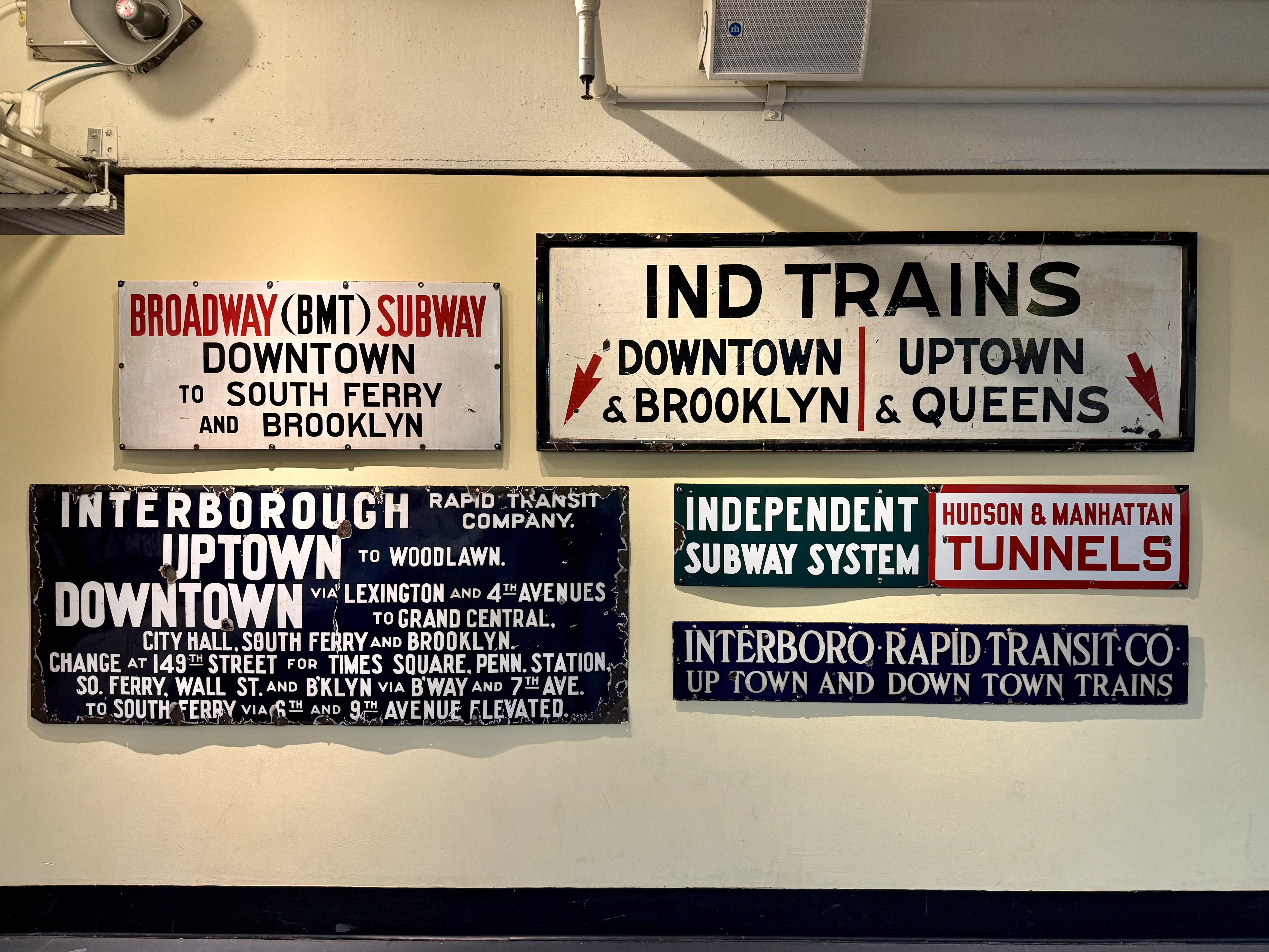
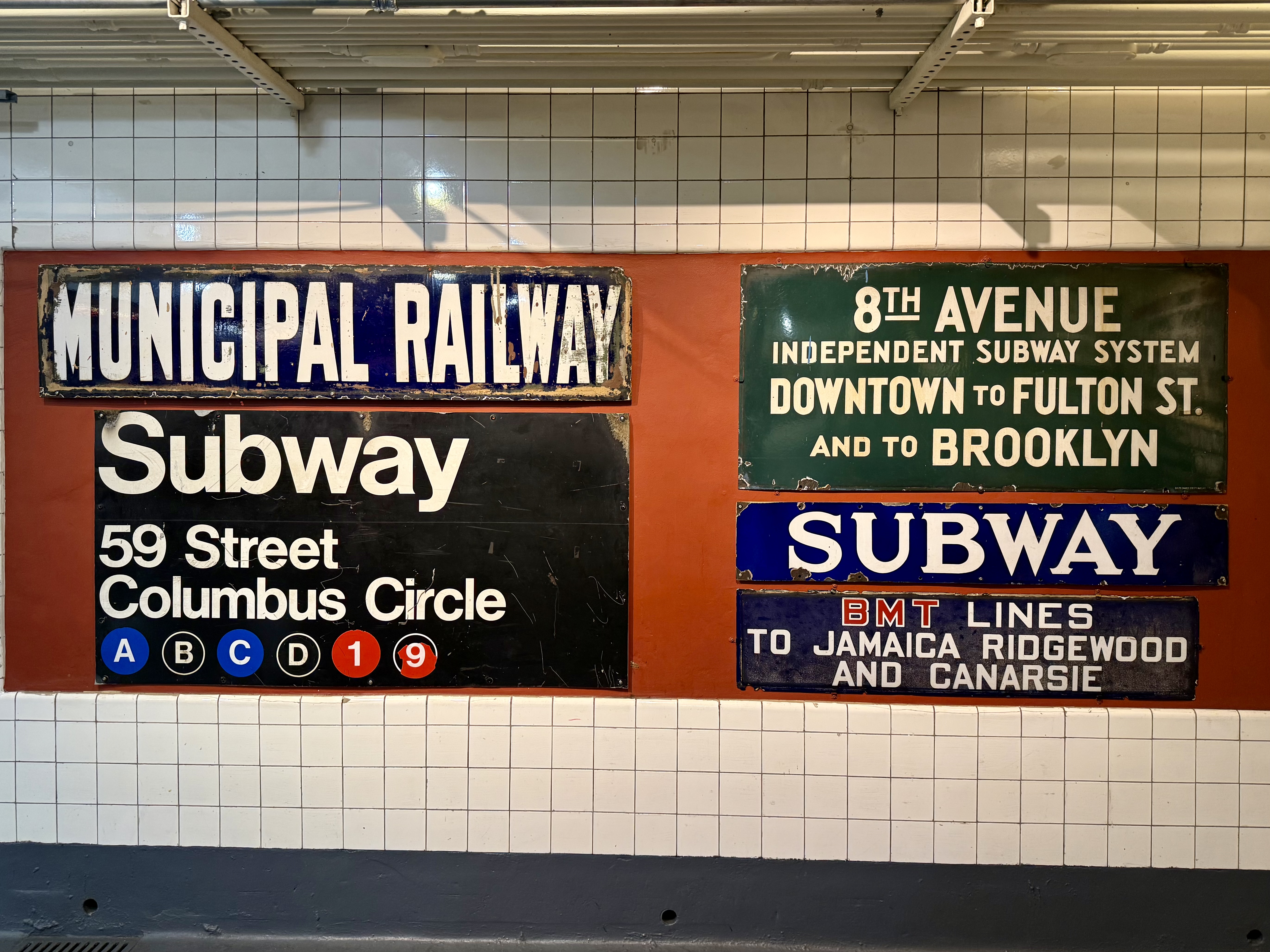
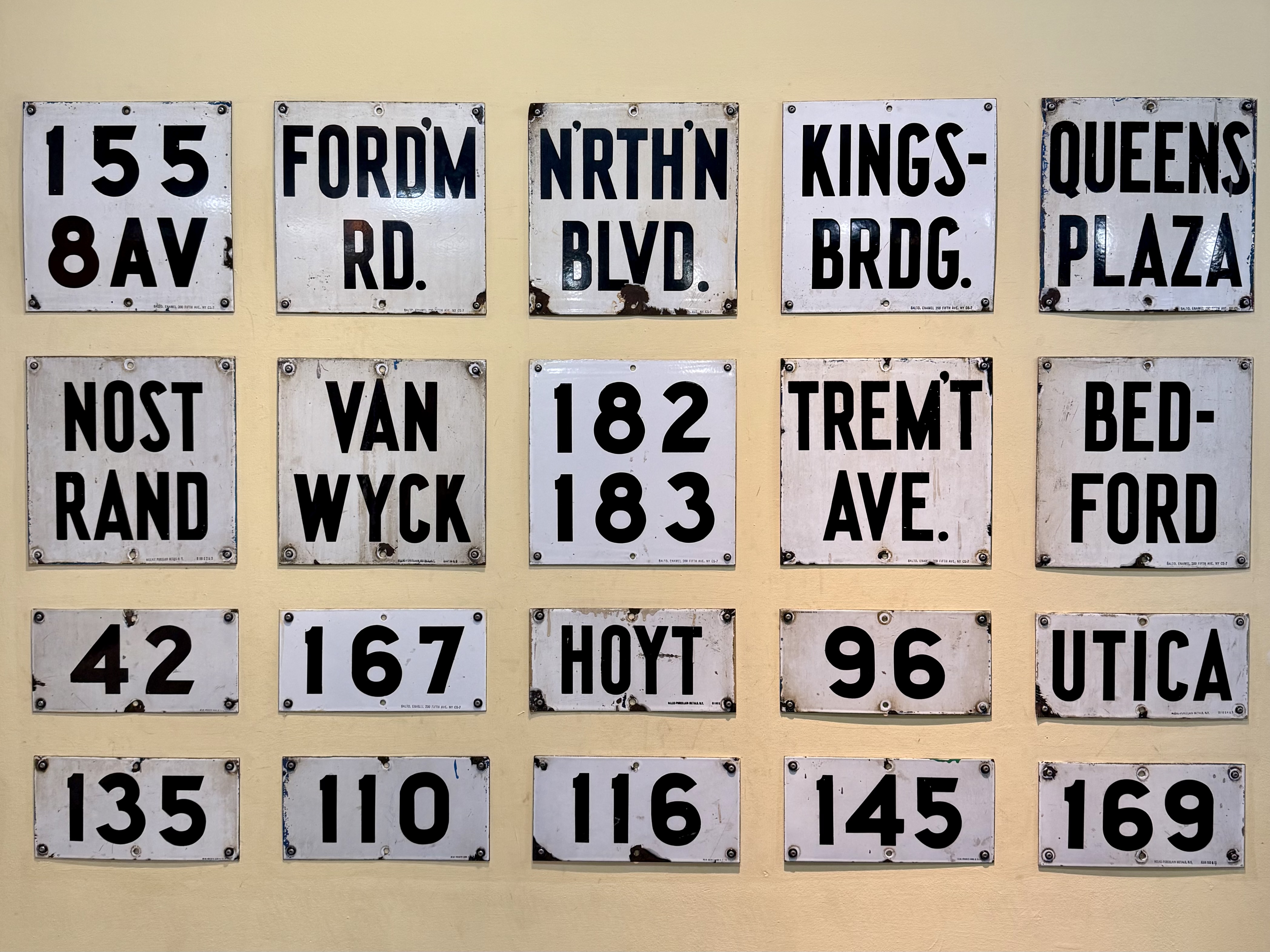
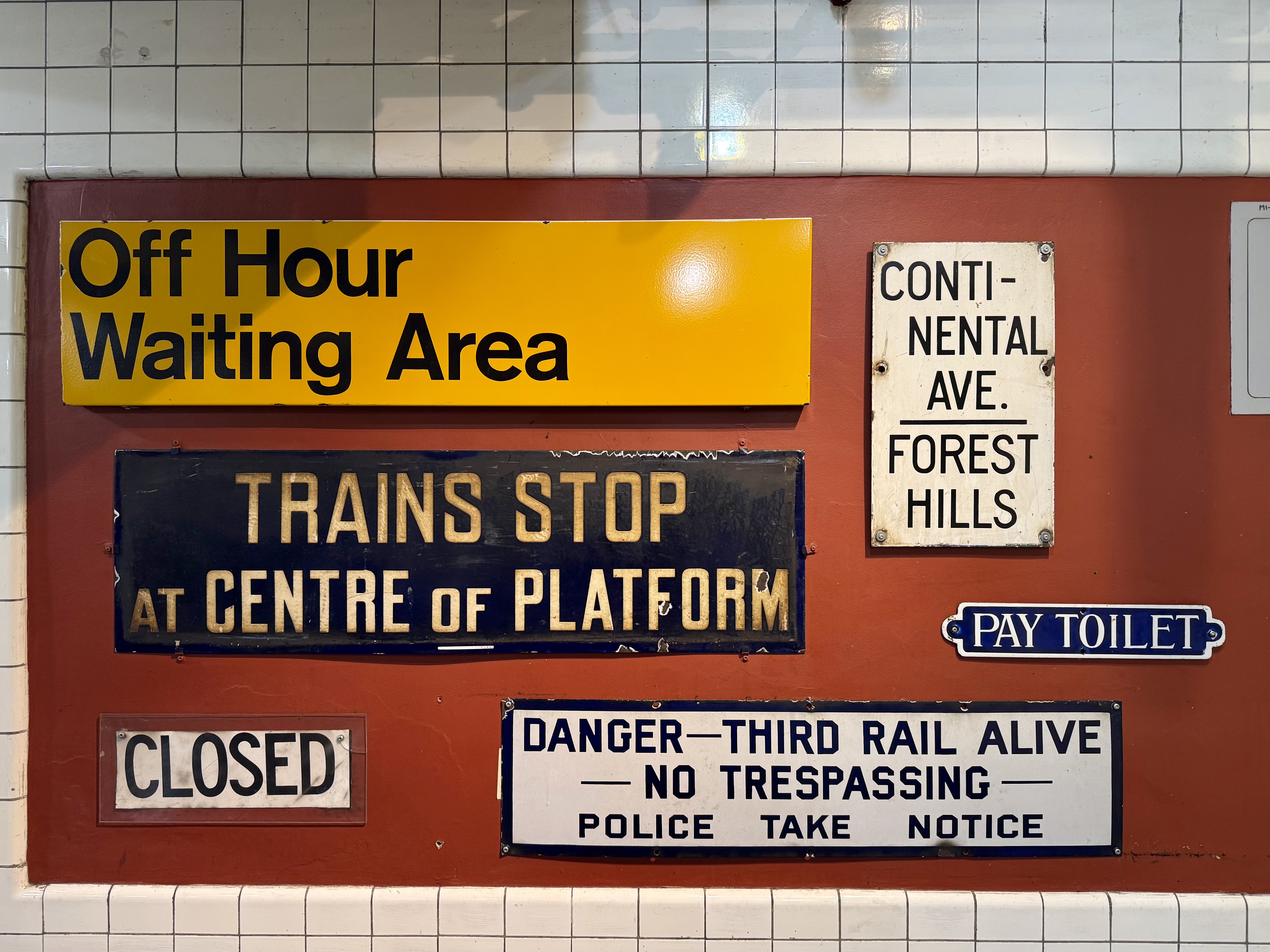
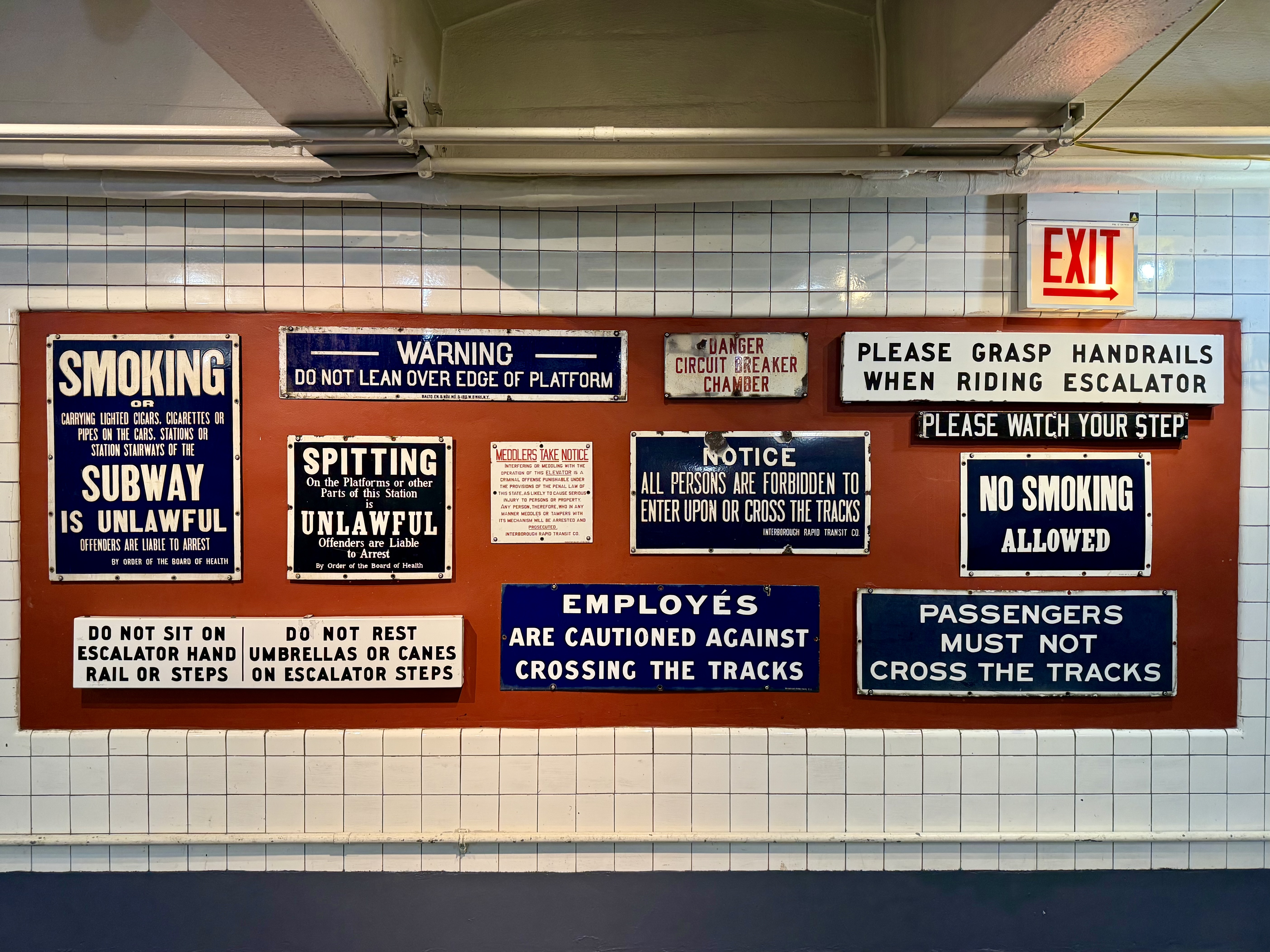
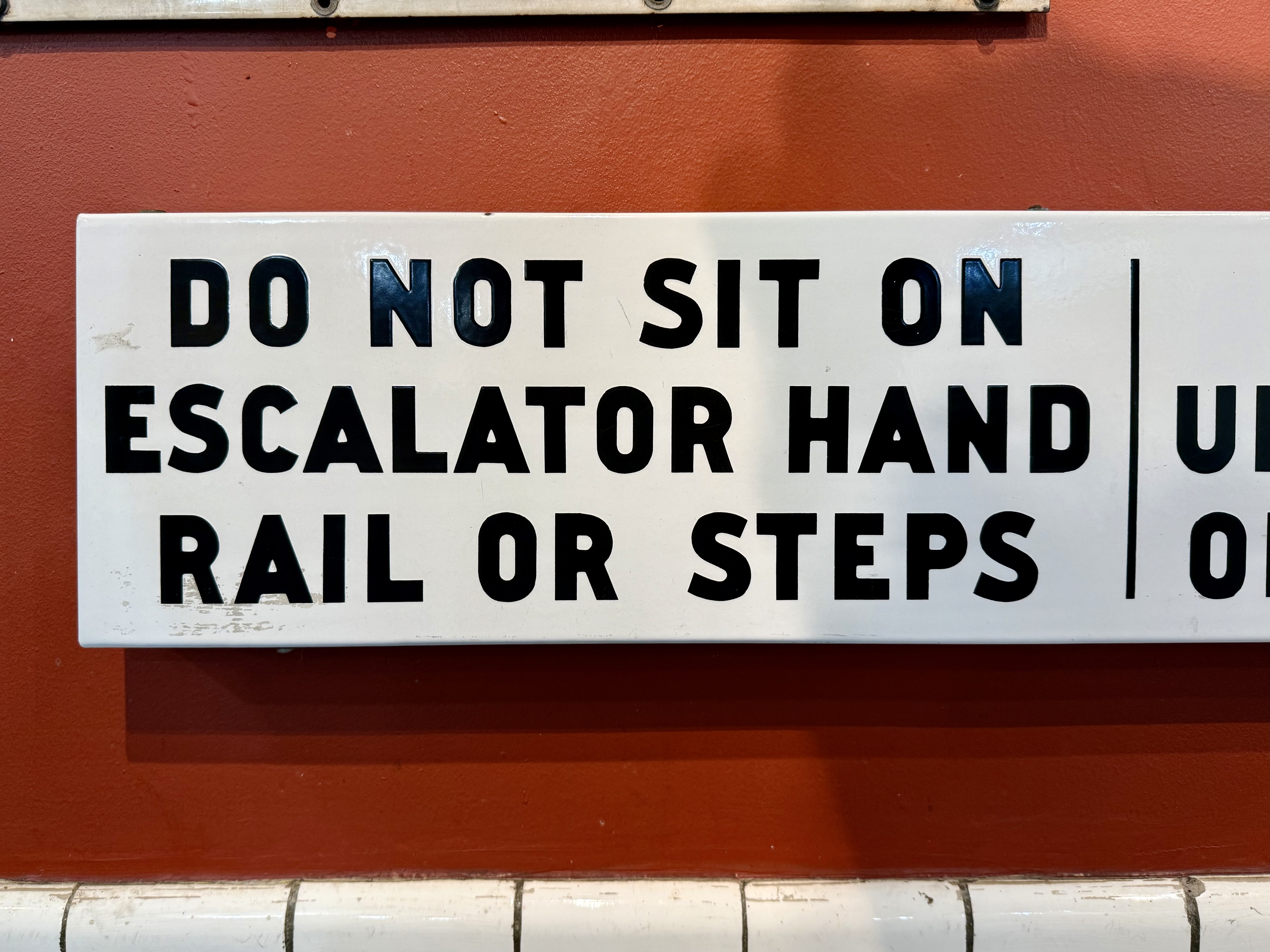
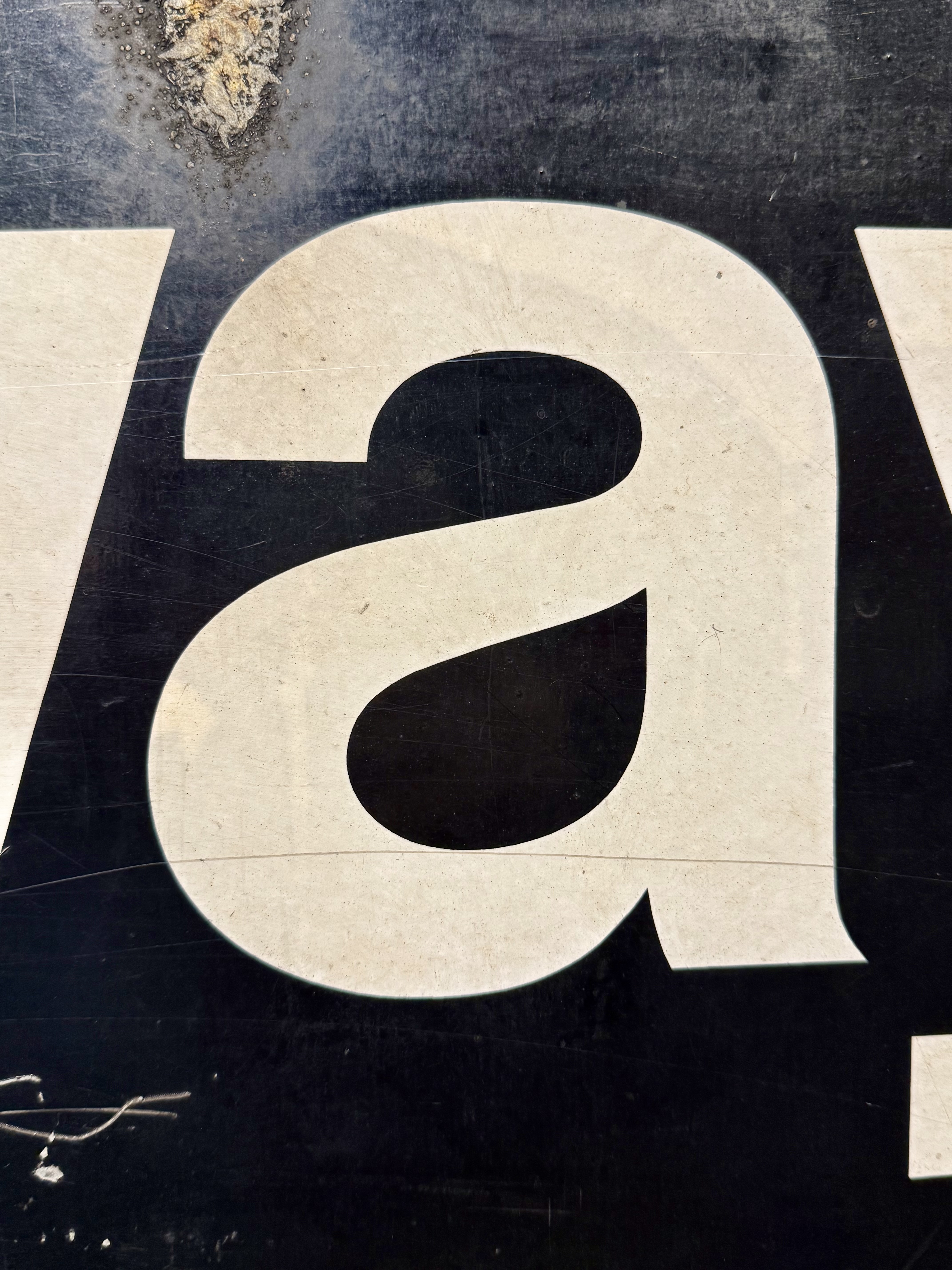
This room was covered wall-to-wall with old transit signage. The historic displays of way-finding marred by age and use were highly legible and in some way still functional even when removed from their original context. What would be a fairly pedestrian experience for most visitors had a profoundly nostalgic effect on me: for the first time in years I had a physical and emotional reaction to typography.
It sounds absurd to be moved by arguably the most mundane exhibit in the place, yet these sorts of oxymoronic displays of hand-made precision that spanned generations were deeply moving. Before satellites beamed our positions directly into an object we carry, millions of people throughout history referred to these words to find their ways home. These words were how people navigated an incredibly complex infrastructure and the design intent was so absolutely robust, they still function decades after being pulled from service.
As the tired but true idiom goes: good design is invisible. In their environment, these signs were not treated as objects to be treasured. They were working words meant to guide people throughout their lives. Only now when we remove them from their original context can we truly appreciate their beauty of form and function.